By Catherine Austin Fitts
My “go to” website for technical analysis of precious metals, the US dollar & the US stock market is Rambus Chartology, where Rambus (that’s his handle – he’s the founding technical analyst) leads a discussion with extensive charts of what the markets are saying.
In January 2016, Rambus launched his quarterly Solari Report with a Blockbuster Chartology. You can find links to the entire series of quarterly and annual Blockbuster Chartologies at the end of this latest piece.
One of the reasons that Rambus is so good at his craft is that he focuses on “staying on the right side of the major trend.” The challenge of doing so at this time is that it is tempting to look for bottoms or to assume that the trend upwards in the US dollar or stock market may be over. However, Rambus consistently brings us back to the discipline of the Chartology. What does price tell us? As he describes so aptly, we are dealing with psychological warfare.
Sitting back once each quarter to get this perspective offers invaluable insight. So, here we go for the 3rd Quarter 2019 Blockbuster Chartology!
Blockbuster Chartology Quarterly Report
By Rambus
~ 3rd Quarter 2019 Wrap Up ~
Quarterly Report Part 1 : US Stock Markets
Quarterly Report Part 2 : World Stock Markets
Quarterly Report Part 3 : Sectors Within the Stock Markets…
Quarterly Report Part 4 : Precious Metals Complex…
Quarterly Report Part 5: Odds and Ends
Quarterly Report Part 1… US Stock Markets
It’s that time again when I break out the long term charts for the “Quarterly Report” I do for Catherine Austin Fits who is the founder of the Solari Report. Doing these quarterly reports every three months forces me to look at the long term picture for the stock markets and other areas of the markets which is the most important aspect of trading the intermediate to long term trends.
It’s somewhat ironic that I start this Quarterly Report on a day when the US stock markets had a big down day. On the short term charts things have a bearish look with today’s price action gapping below a one year trendline. Our focus though is on the longer term charts which still show the January 2018 trading range still under construction for the SPX. The price action has technically completed the minimum of four reversal points which puts the trading range into the consolidation pattern category which at this point is an expanding triangle.These patterns can be either bullish or bearish depending on what direction the breakout occurs.
This monthly chart shows the four year H&S bottom with the head that formed at the 2009 crash low. During the 2015 correction the SPX consolidated the first impulse move up by creating the blue expanding falling wedge halfway pattern. The blue expanding falling wedge had a price objective up to 2875 using the breakout to breakout method, blue arrows, which is where our current trading range began to form in January of 2018. So at this point the January 2018 trading range is still maturing with no confirmed direction of the next big move.
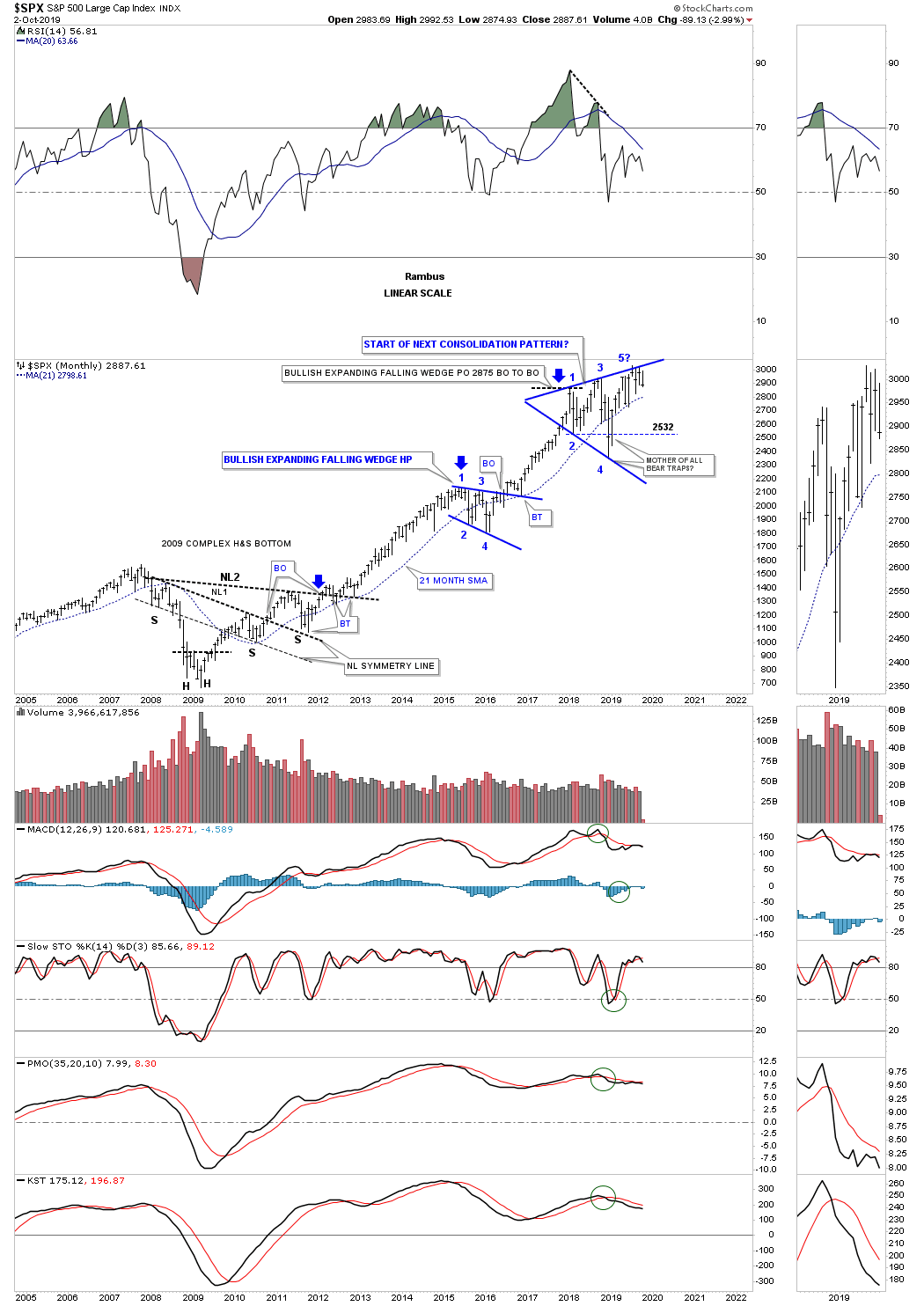
I know many are looking at our latest trading range, the 2018 expanding triangle, as the end of the bull market and a crash of epic proportion will soon be upon us. The true breakout above the top rail hasn’t yet occurred but if it does we will see another impulse leg higher in the ongoing bull market that began at the 2009 crash low. If the bears are correct then we’ll see the bottom rail of the expanding triangle give way which would be the official end of the 2009 bull market.
Until then the price action is still trading above the 21 month sma which is my line in the sand between a bull and bear market. As long as the SPX trades above the 21 month sma the bulls are in charge and below the 21 month sma the bears are in charge. At this point the price action is trading roughly 100 points above the 21 month sma. The job of a trading range is to wear out both the bulls and bears alike until one side wins out. In a bull market the bulls will generally win the battle.
Late last year on December 24th the SPX put in a spike low and reversed strongly to the upside. I’ve often looked at that spike low as a head of a potential H&S bottom.

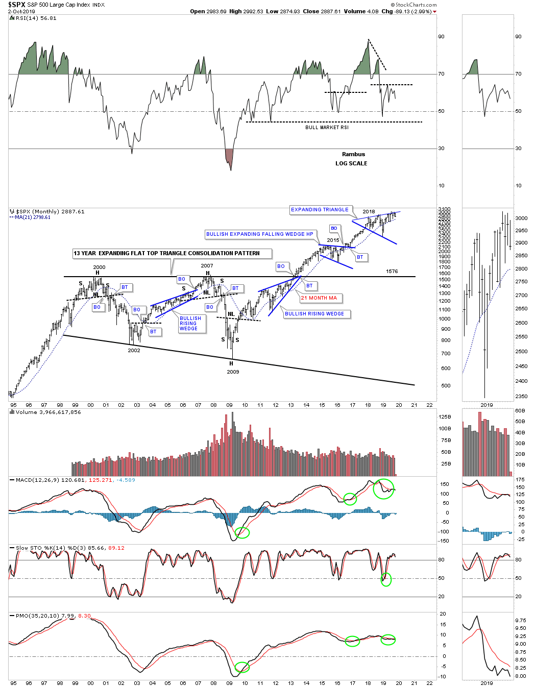
With the 2018 trading range still incomplete, below is a 75 year quarterly chart which shows how the 2018 trading range fits into the very big picture which looks very small. You can compare the impulse move out of the 1970s massive bullish rising wedge to our current impulse move out of the 13 year bullish expanding flat top triangle. You can see the 1987 crash, which is still the biggest one day percentage move in history for the SPX, but doesn’t look that bad from the long term perspective. If the SPX corrects down to the bottom rail of the 2018 expanding triangle that still wouldn’t end the bull market, but if it fails the 2009 bull market will be completed.
Next lets look at the INDU and the infamous “JAWS OF LIFE” consolidation pattern that many were calling the, Jaws of Death, and the end of the bull market during its formation. Just like most of the big 13 year consolidation patterns that have formed on many of the US stock markets the INDU did breakout above the top rail of its 2013, Jaws of Life consolidation pattern, but it had a laborious backtest which took several years to complete. Even though the backtesting process took a long time to complete I never gave up that we would see a bullish outcome which we had already seen with the SPX. Note our current consolidation pattern, the blue expanding triangle, which I’ve labeled as, “Baby Jaws of Life.” with the father being the 13 year “Jaws of Life”.
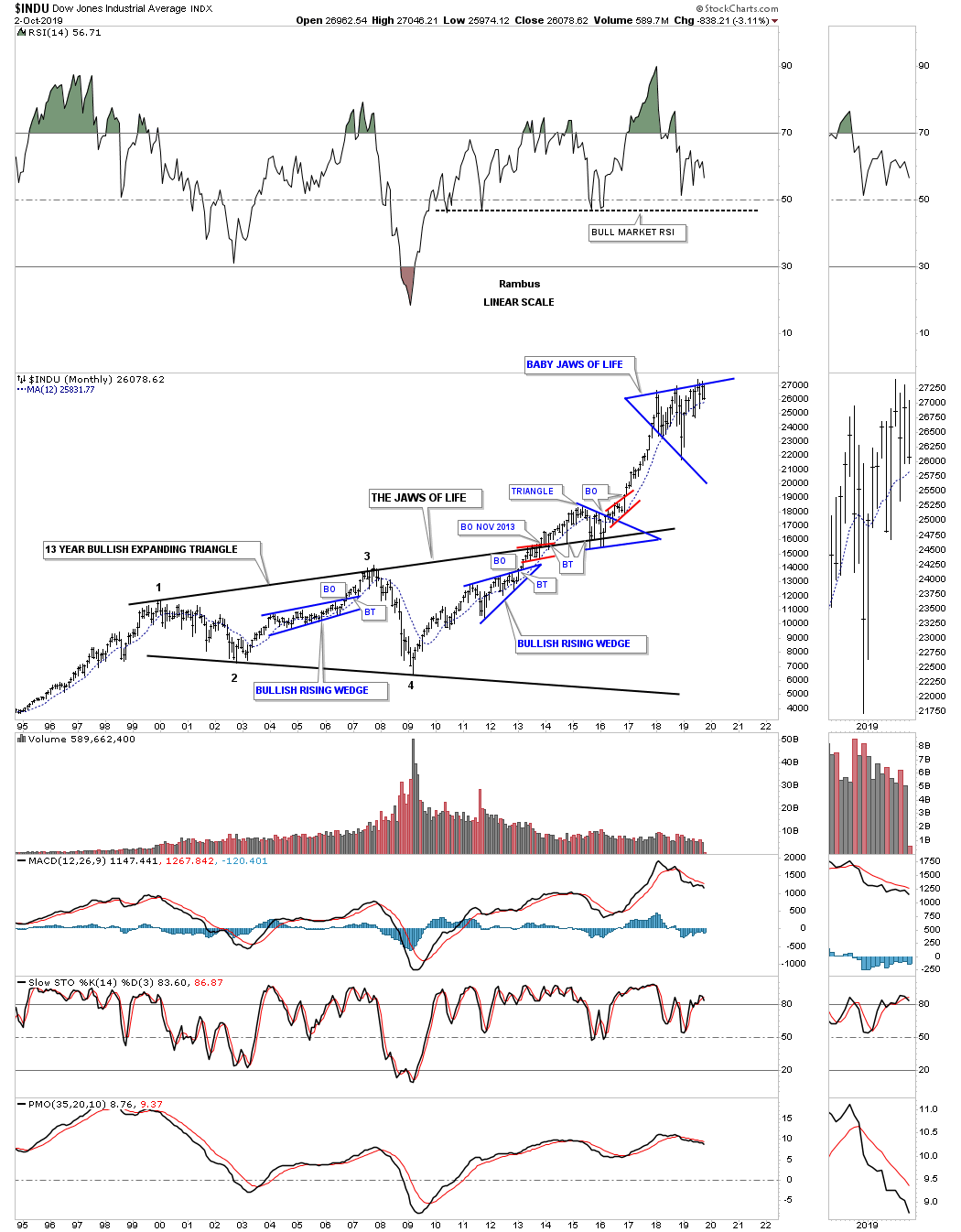
Next is the 75 year quarterly chart for the INDU which puts the 13 year Jaws of Life consolidation pattern in perspective. First note the 17 year H&S consolidation pattern which formed from 1966 to the breakout in 1982 which again led to the secular bull market that ended in 2000. Most have forgotten the worse trading day in US history occurred in 1987 that truly felt like the end of the world. As you can see what felt like the end of the world was only the beginning of the next consolidation phase that built out the bullish rising wedge halfway pattern. Note how similar the breaking out and backtesting process was to the 1970’s neckline and the top rail of the Jaws of Life. That’s classic Chartology on any timeframe. I added the blue circle around our 2018 trading range as it looks so small on this 75 year quarterly chart for perspective.

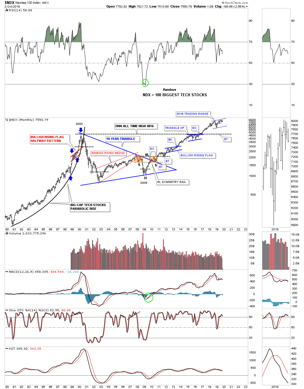
During the last secular bull market the NDX 100 produced a parabolic move into its 2000 high which marked the beginning of its 10 year triangle consolidation pattern. Note the classic H&S bottom that formed at the last reversal point in the 10 year triangle with the left shoulder and head forming inside the triangle while the right shoulder low formed on the backtest to the top rail. Also note the blue triangle that formed just below the all time highs which finally gave the NDX enough energy to breakout above the old all time highs to new all time highs which has led to our current 2018 trading range. I still view the 2018 trading range as incomplete yet. At some point there will be an obvious consolidation pattern or reversal pattern, until then the trading range continues to mature.
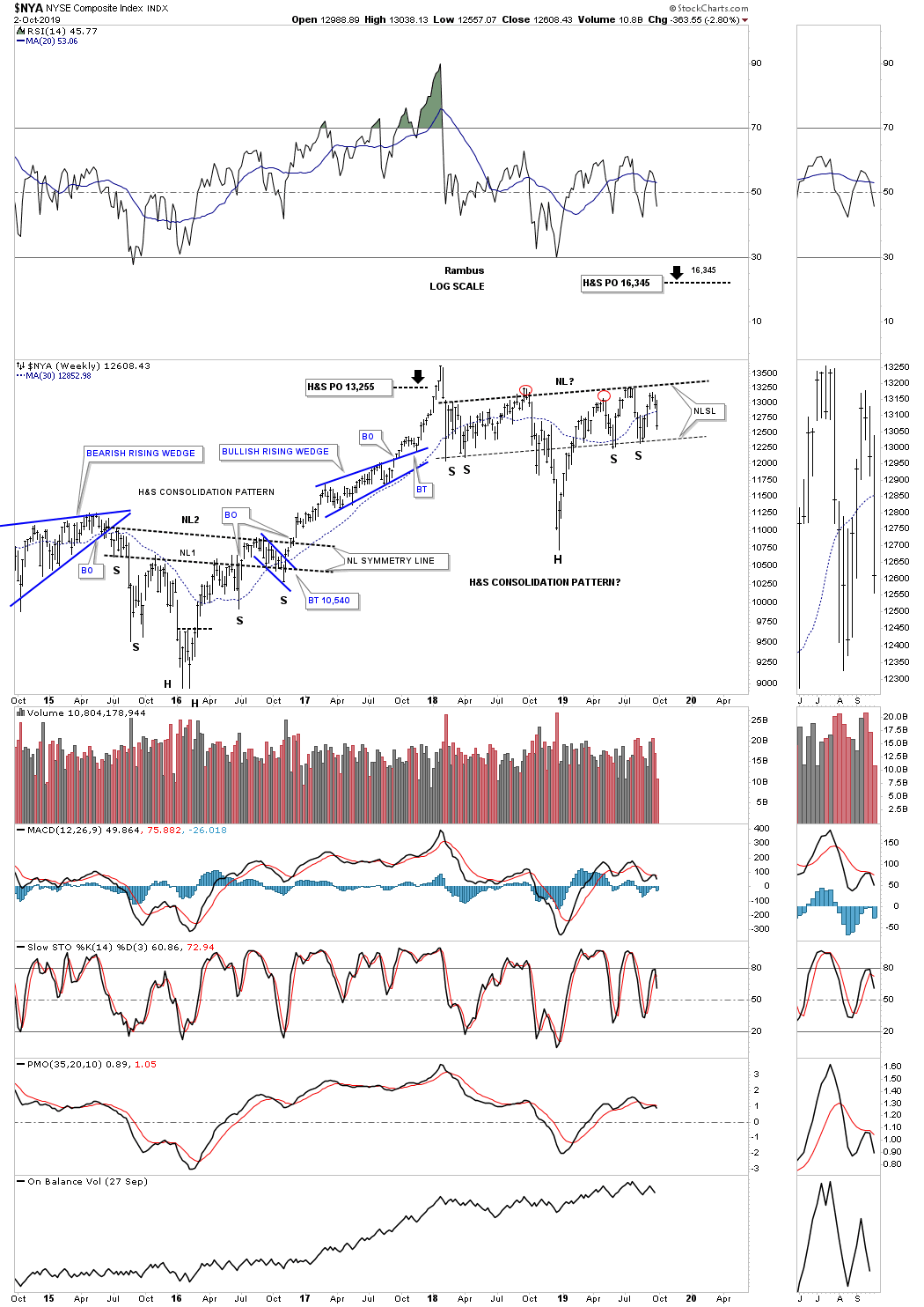
Next is a 5 year weekly chart for the $NYA, which still gives me hope that the US stock markets are still working on their 2018 trading range. Since the 2018 high the $NYA has been building out an almost perfect H&S consolidation pattern. As you can see it is very similar in time and price to the H&S bottom that built out at the 2016 low which was also very symmetrical and ended up with two necklines.
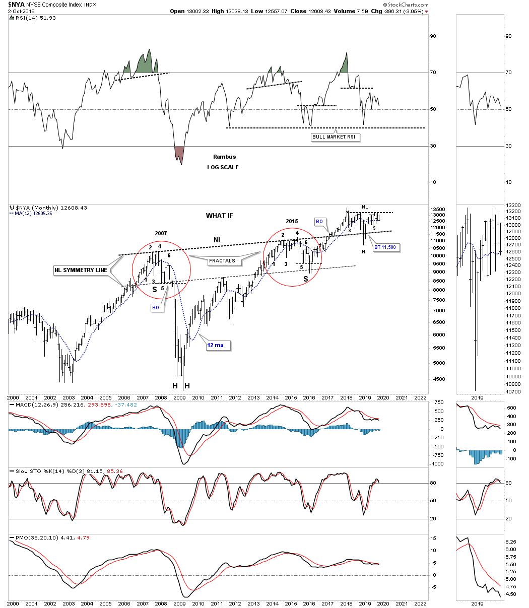
I first started showing this long term monthly chart for the $NYA back in 2015 when it looked like the price action was building out a fractal. At the time I was comparing the 2015 price action to the 2007 price action as shown by the red circles. I’m not a big fan of fractals because they usually fall apart just when you think they should work. To see how tight the two fractals were just follow reversal point #1 on the left side and compare it to reversal point #1 on the right side. Then do the same for each number comparing the left side to the right side.
Note the thin dashed horizontal line just below reversal point #5 on each fractal. In 2007 the price action broke below the thin dashed line with a quick backtest and then the crash sequence to the downside. Note that same point just below the horizontal dashed line during the 2015 fractal. You can see the price action broke below reversal point #5 which matched the 2007 fractal to a tee but then a strange thing happened. Instead of crashing like the 2007 fractal shows the NYA reversed hard to the upside negating the 2007 fractal at the last moment. In doing so what was left behind was a massive H&S bottom with both fractals being the left and right shoulders. Why this potential massive H&S bottom is still in play is because of the backtest to the neckline which occurred last December on Christmas Eve. It looked like the neckline might be failing but a strong rally negated the strong backtest.
Below is 35 year look at the OEX 100 which shows its own 13 year bullish expanding falling wedge consolidation pattern. As you can see the 13 year consolidation pattern is very similar to the other indexes we looked at tonight but it is slopping down instead of expanding like the, Jaws of Life, on the INDU.

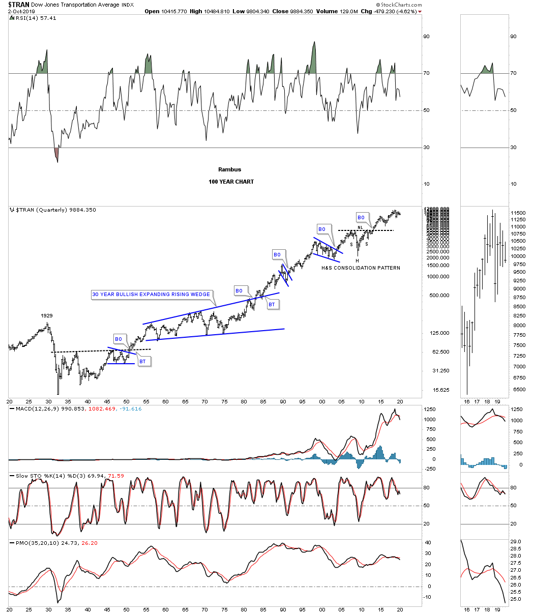
Next is a 20 year chart for the Transportation Average with the dominate chart pattern being the massive 2009 H&S consolidation pattern which was very symmetrical as shown by the neckline symmetry line. The Transportation Average has been working on its latest consolidation pattern which is the blue diamond. Whichever direction the breakout occurs should have a big influence on the rest of the US stock markets.
![]()
This last chart for tonight is the 100 year quarterly chart for the Transportation Average which shows how the 2009 H&S consolidation pattern fits into the very big picture.
Anything is possible short term with the US stocks markets as we may have seen today with the breakout below the one year trading range. On the other hand these long term charts are still in play and have been in play since 2013 when most broke out from their 13 year trading ranges. At some point all good things must come to an end and that goes for the US stock markets as well. What will separate the bull market from a bear market for me will be the 21 month sma on the SPX which is still about 100 points higher.
This concludes part 1 of the Quarterly Report. Next we’ll look at some of the important stock markets around the world that may be a bit surprising to many. All the best…Rambus
Quarterly Report Part 2… World Stock Markets
In part 2 of the Quarterly Report we’ll look at some of the larger world stock markets to see if their 2009 bull markets are showing signs of aging and getting ready to roll over into a bear market as many analysts are projecting. Over the last three months since the last Quarterly Report not much has changed as the 2018 trading range continues to develop. These are frustrating times to be an investor as there are no trends in place just the chopping action of a trading range. Most of the charts below will show a big multi year consolidation pattern which is very similar to many of the multi year patterns that we looked at on the US stock markets in part one of the quarterly report. The charts to follow will be in no particular order and will show the 12 month sma as part of the big picture.
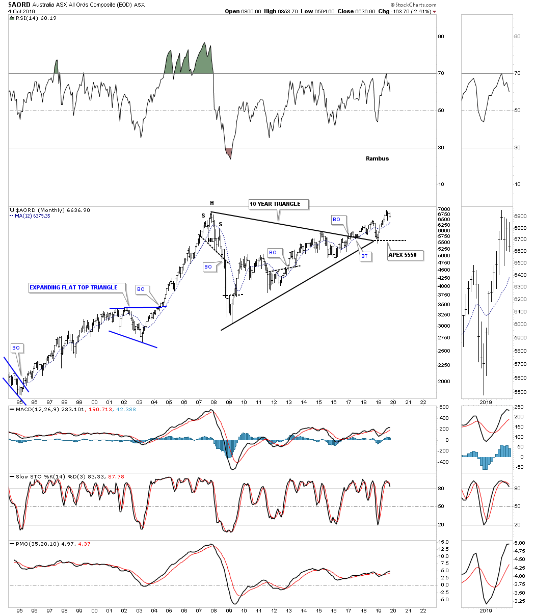
After breaking out from its 10 year triangle consolidation pattern the $AORD, Australian stock market, found support at the apex and is now approaching the all time high made in 2007. This is the point where we should see a slight pause that forms a small consolidation pattern just below the all time highs if the bulls are going to win the battle.
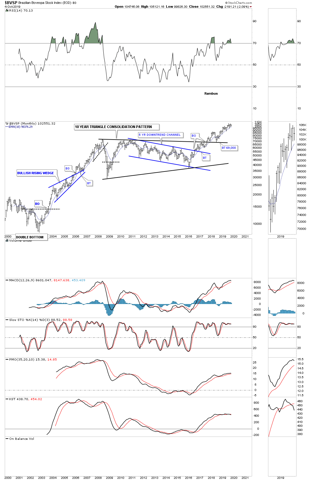
Next is the $BVSP, Brazilian stock market, which has been one of the stronger world stock markets since it broke out from its 10 year triangle consolidation pattern. After a nice clean backtest to the top rail it’s now trading at new all time highs in its steady impulse move higher.
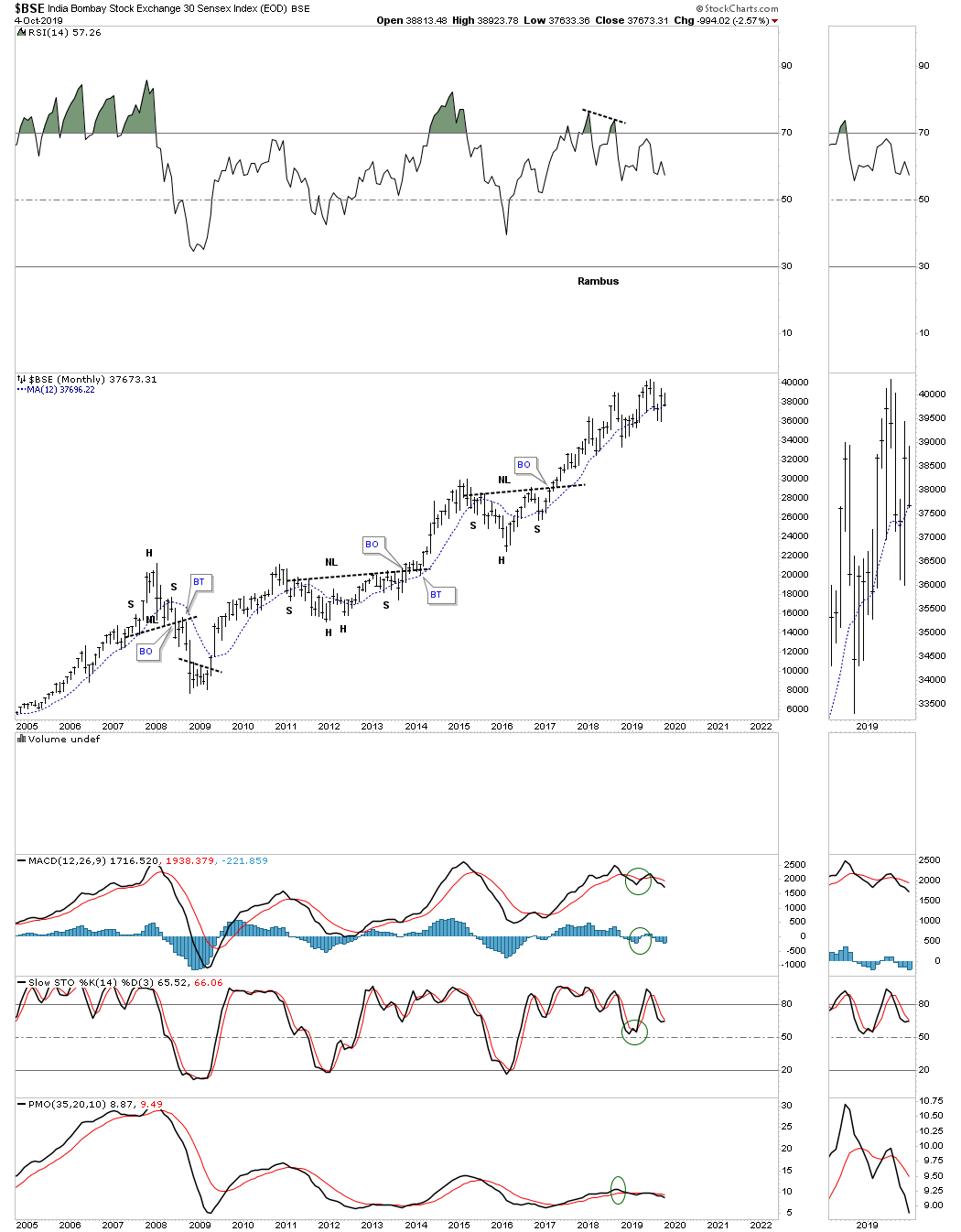
The $BSE, India Bombay stock market, has been another strong performing world stock market which has been steadily climbing higher since its 2009 low forming two H&S consolidation patterns along the way.
Next is the $CAC, French stock market, that broke out from its 17 year triangle consolidation pattern in March of 2017. There was a strong backtest to the top rail which is now the line in the sand, above is bullish and below is bearish. You would have to go all the way back to January of 2008 to see the same high that was just recently made as shown by the thin black dashed horizontal line.

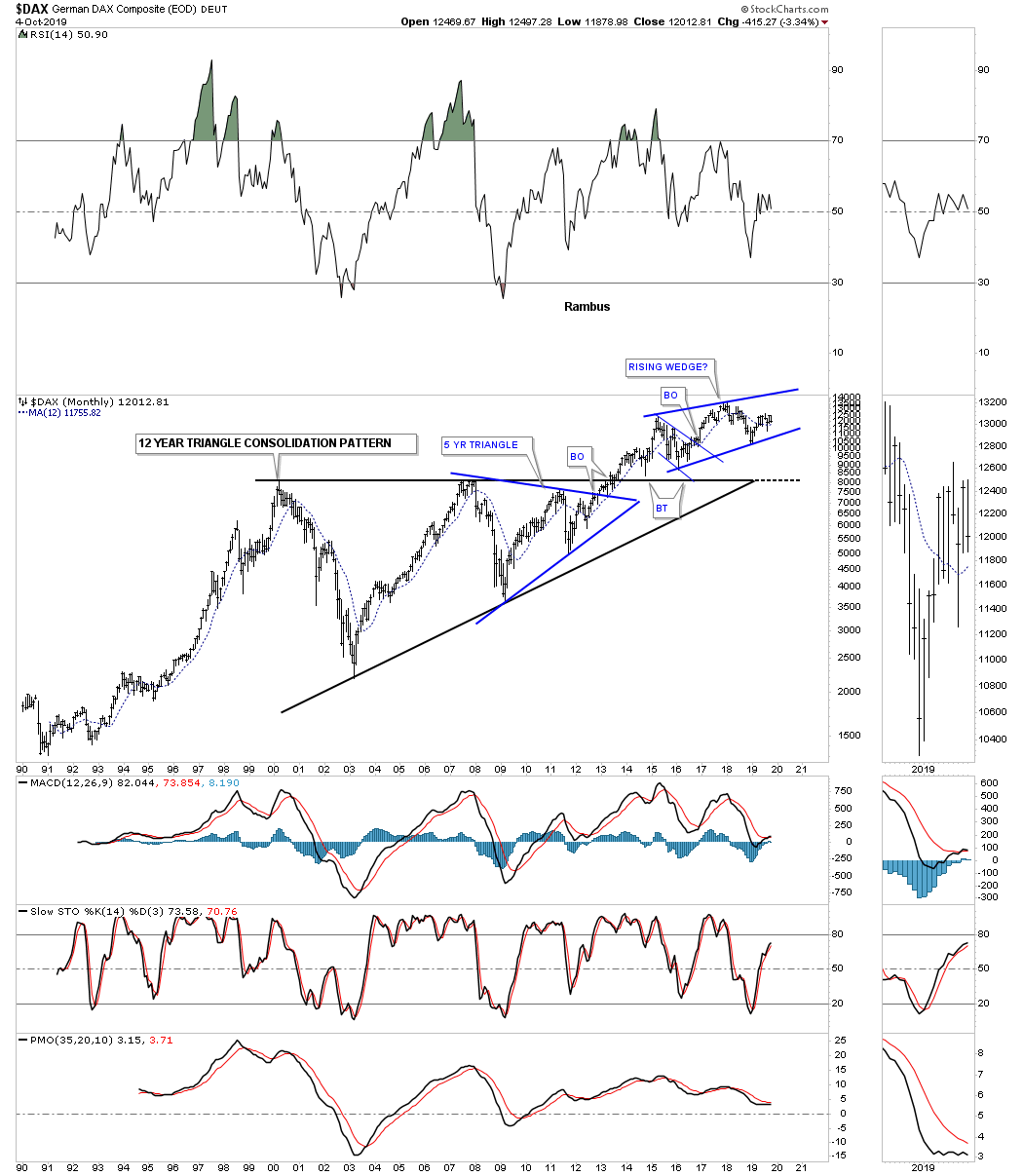
After breaking out from its 12 year triangle consolidation pattern in 2013 along with most of the US stock markets the $DAX, German stock market, is in the process of building out a multi year rising wedge formation just above the top rail of the 12 year triangle which is generally a bullish setup. As always whichever direction the rising wedge breaks out a decent move should take place.
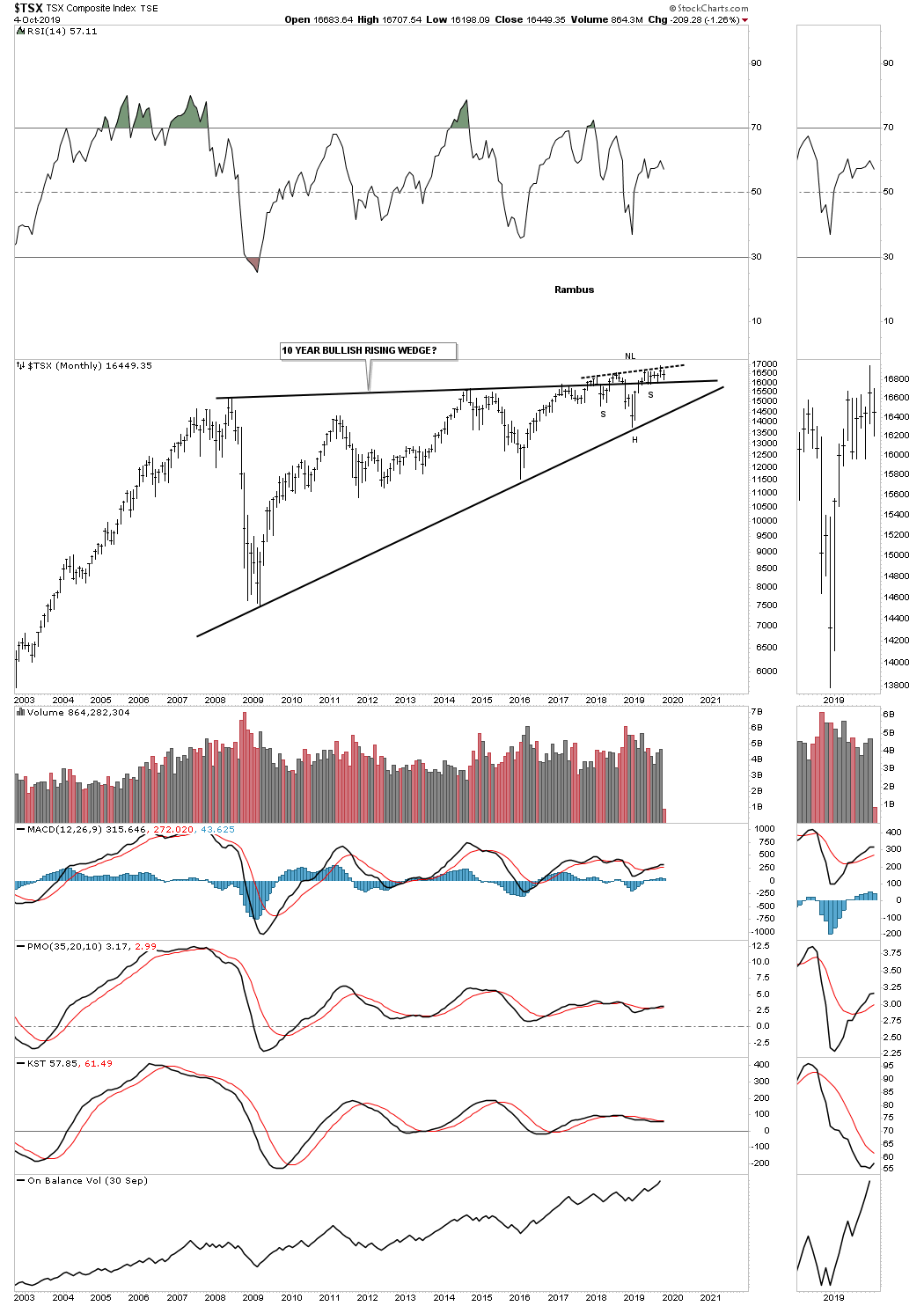
Below is the TSX, Canadian stock market, which I’ve tweak just a bit since the last time we looked at this long term quarterly chart. As you can see the top rail is slightly rising which is creating a rising wedge formation. I also added the potential H&S bottom which is forming at the last reversal point of the rising wedge which could have bullish consequences if it succeeds.
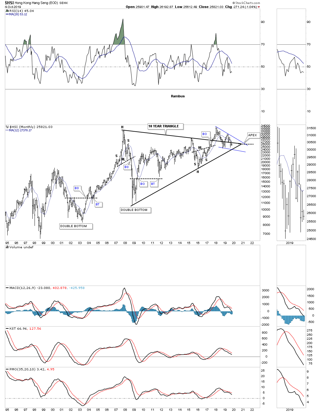
The $HSI, Hong Kong stock market, has been attempting to breakout from its 10 year triangle but is currently in a strong backtest trading below the top rail and the apex. In order to keep the 10 year triangle alive as a consolidation pattern the bottom rail needs to really hold support.
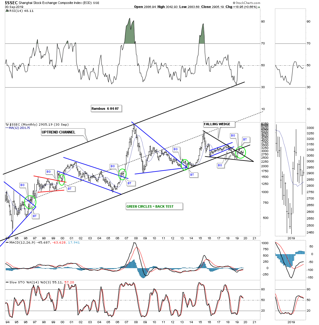
The SSEC, Shanghai stock market, has broken below the bottom rail of its 1992 uptrend channel. There is a potential falling wedge which is forming on the bottom rail which could have bullish or bearish consequences depending on which direction the breakout occurs. The price action is currently doing a ping pong move between the bottom rail of the major uptrend channel and the top rail of the black falling wedge. In order to negate the breakout below the bottom rail of the major uptrend channel we’ll need to see the price action trade back above that now very important trendline.
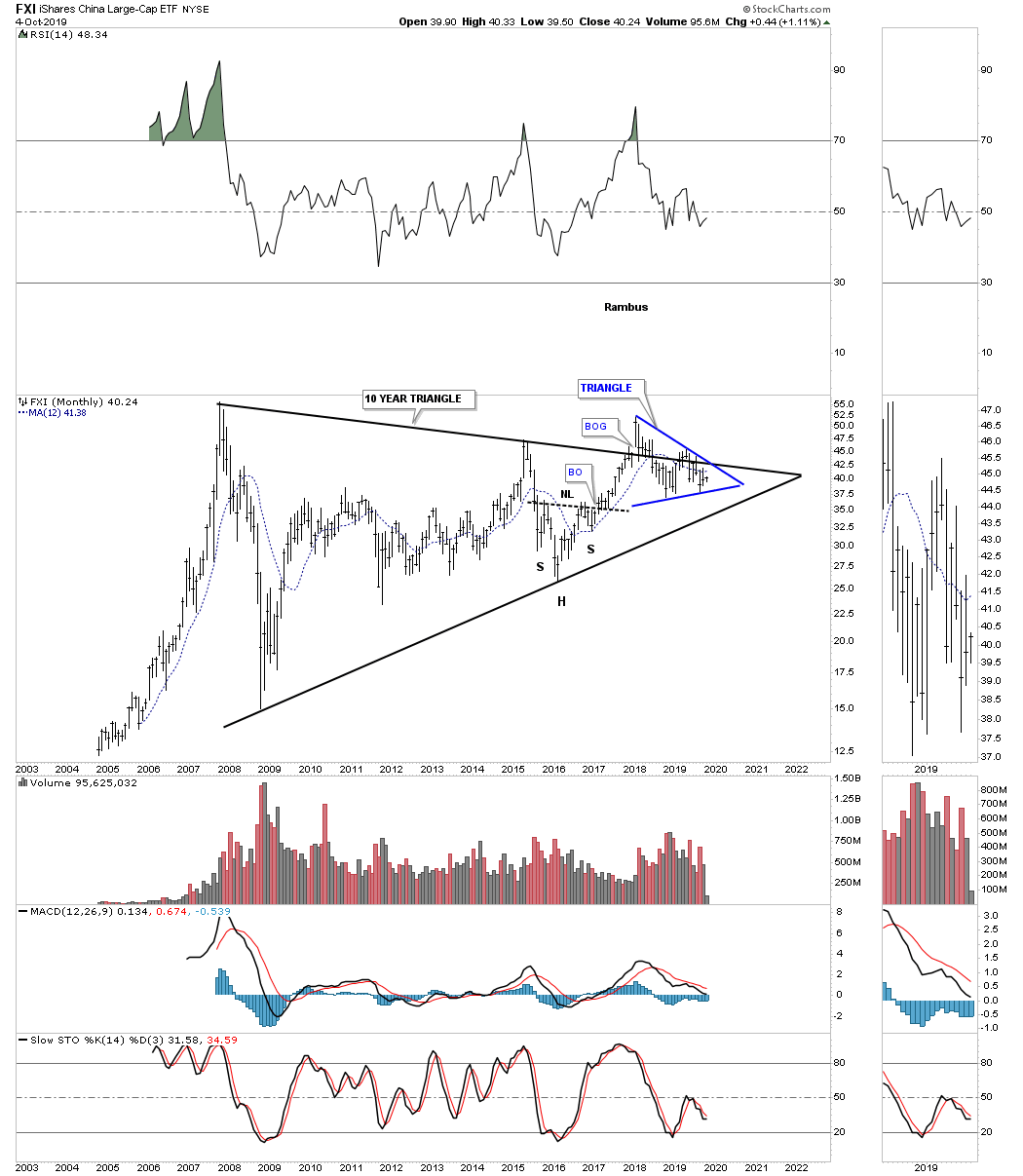
Next is the FXI, China large cap eft, which is building out a 10 year triangle trading range with no confirmed breakout in either direction as of yet. What we do have is the blue triangle forming right on the top rail of the 10 year triangle which can have a similar outcome as a consolidation pattern that forms just below an important trendline or one that forms just above the important trendline.
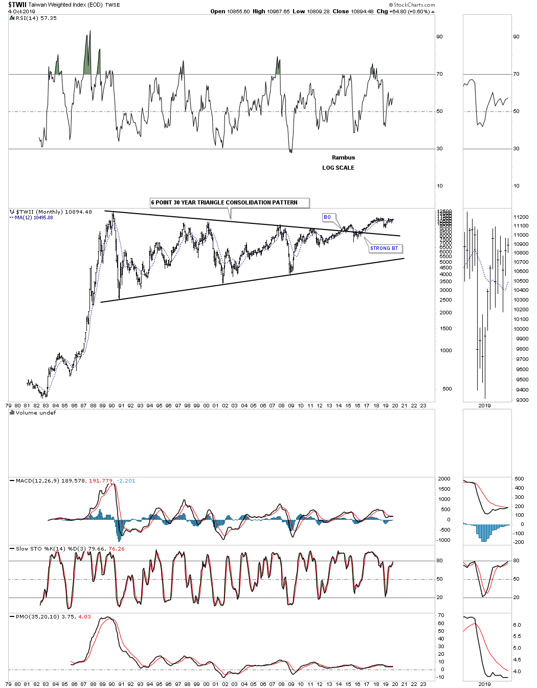
The $TWII, Taiwan stock market, has built out one of the largest consolidation patterns I’ve ever seen. After 30 years and six reversal points later the $TWII stock market finally broke out above the top rail in May of 2014. At this point I would like to see the all time high made back in February of 1990 taken out to add more confirmation the breakout is gaining traction.
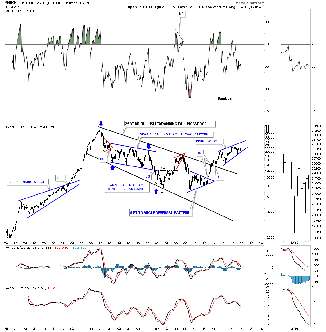
The $NIKK, Tokyo stock market, is setup much differently than many of the world stock markets we’ve reviewed. After its parabolic run Into its 1989 high it took 25 years to consolidate those massive gains forming a bullish expanding falling wedge. The price action is currently working on a four year rising wedge with the direction of the breakout undecided yet.
The AAXJ is an all Asian ex Japan etf, which shows it broke out from its six year bullish rising wedge with a backtest to the top rail about a year ago.

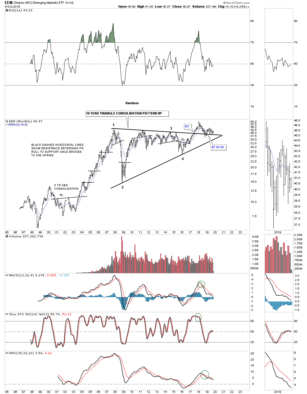
The EEM, emerging markets etf, built out a beautiful 10 year triangle consolidation pattern with a breakout and now the backtest is underway which needs to hold support.
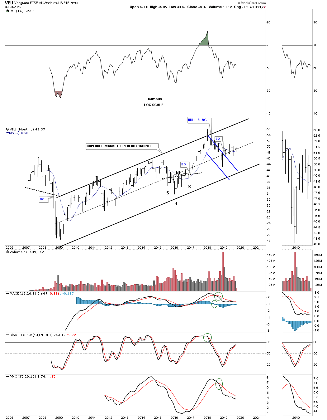
The VEU, All world ex the US etf, has built out a beautiful 2009 bull market uptrend channel with the recent price action breaking out from the blue flag.
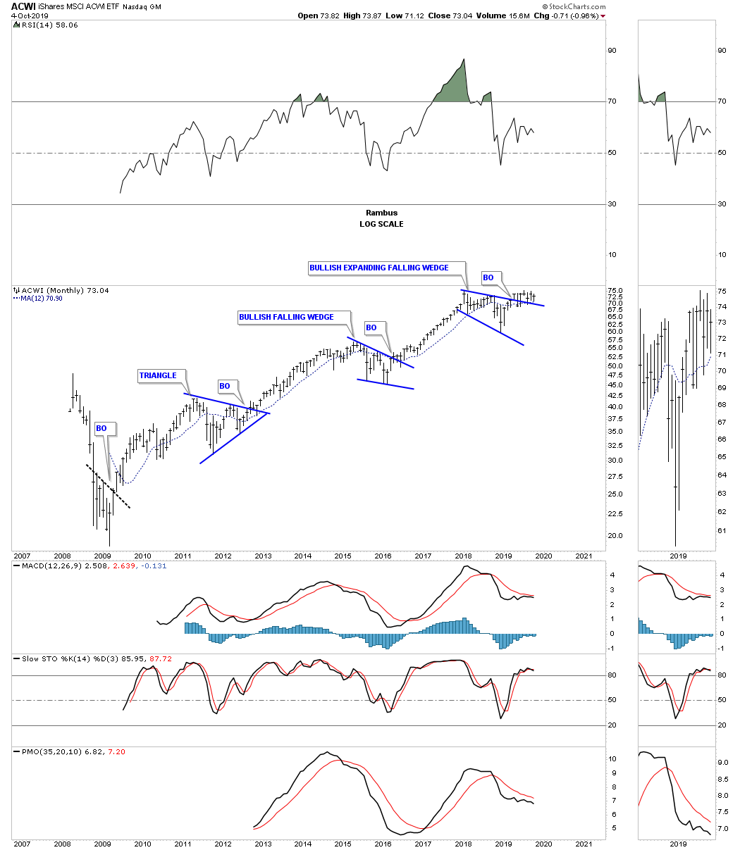
This next chart for tonight is the ACWI, all world stock markets, that resembles the bull market in some of the US stock markets with three consolidation patterns in place since its 2009 crash low. The price action is currently breaking out and backtesting the top rail of its 2018 bullish expanding falling wedge.
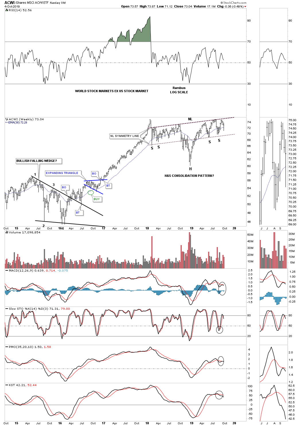
This last chart for tonight is a weekly look at the ACWI, all world stock markets ex the US stock market, which is suggesting the rest of the world stock markets may not be as bearish as many think. This potential H&S consolidation pattern also shows up on some of the US stock markets as well. So far this is a very symmetrical H&S pattern that is building out. Until the neckline is broken to the upside though this potential bullish H&S consolidation pattern is still in the potential bullish category.
Maybe the fundamentals are suggesting the world is getting ready to crash and burn as so many analyst are suggesting. From a Chartology perspective maybe its a bit too early to expect the US and world stock markets to begin their new bear markets. After looking at all the charts above there is nothing in the charts that is suggesting the end of the world as we know it is upon us, but just the opposite. One day the end will come but for now enjoy the bull markets from around the world while they last. All the best…Rambus
Quarterly Report Part 3… Sectors Within the Stock Markets…
This is where we find out which areas within the markets have been doing the best or the worst. During a correction money tends to rotate from one area to another until each sector works on completing their consolidation phase. Some sectors will have a mild correction which is where the stronger stocks will be, while other sectors will experience a deeper correction which will shake a lot of investors out of their shares.
How long these consolidation phases can last is one of the hardest things to figure out on the front end. Normally the bigger the impulse move the bigger the correction will be to consolidate those gains before the next leg up can begin. As we know there has to be at least a minimum of four reversal points during the formation of a consolidation pattern. What can be hard on our patience is when there are six, eight or even more reversal points before the consolidation pattern is finally finished doing its job of confusing both the bulls and bears alike.
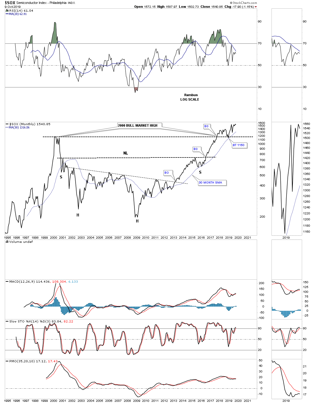
Lets start with the $SOX, semiconductor index, which is one of the stronger areas within the markets right now. After topping out in 2018 like just about everything else related to the stock markets the $SOX formed a blue expanding falling wedge right on the 2000 all time high trendline. The price action has been backing and filling just above the 2000 all time highs for most of this year.
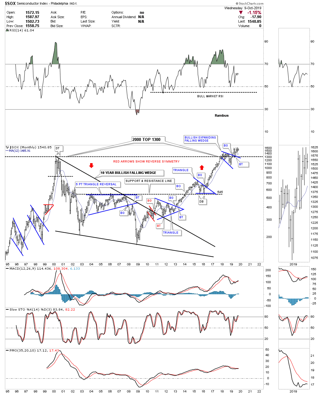
This monthly line chart for the $SOX takes out some of the noise a bar chart can make and shows the 2000 bull market high trendline with a breakout and backtest. The current price action is trading just off of the all time highs. For whatever reasons the 30 month sma has done a good job of holding support since the bull market began in 2009.
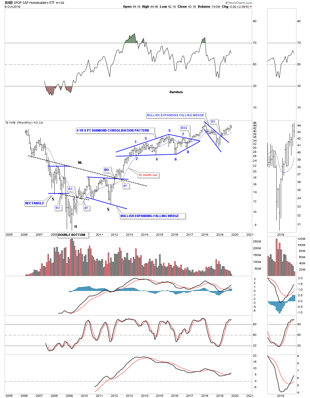
The XHB, Homebuilders etf, is still moving higher after breaking out from its blue expanding falling wedge black in February of this year and is trading just off of its all time highs.
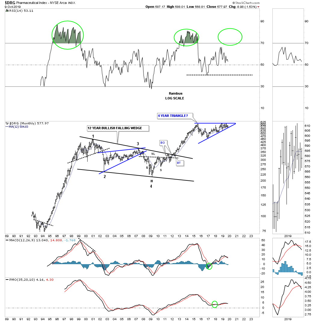
Below is a long term monthly chart for the $DRG, Pharmaceuticals, which is trading in a four year triangle close to its all time highs.
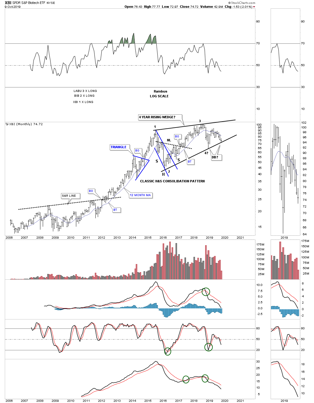
The XBI, Biotech etf, is currently testing very important support on the bottom rail of its 4 year rising wedge formation. This rising wedge is still incomplete until the top rail is reached to complete the all important 4th reversal point.
The XLV, Healthcare fund, is another important area that is currently testing the bottom rail of its 2015 rising wedge formation. As you can see this sector had an incredible run out of its 2009 bear market low to the initial high made in 2015 at reversal point #1.

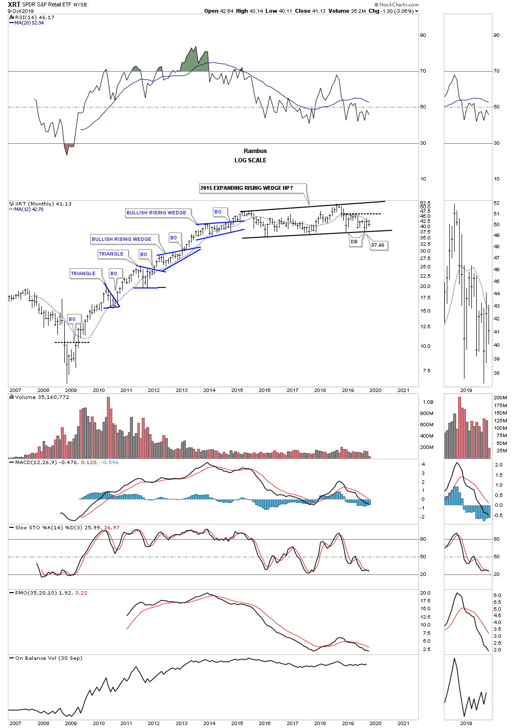
Another area that did very well out of its 2009 bear market low was the XRT, Retail etf, which like many of the indexes we’ve looked at topped out in 2015 and has been basically trading sideways for the last four years or so.
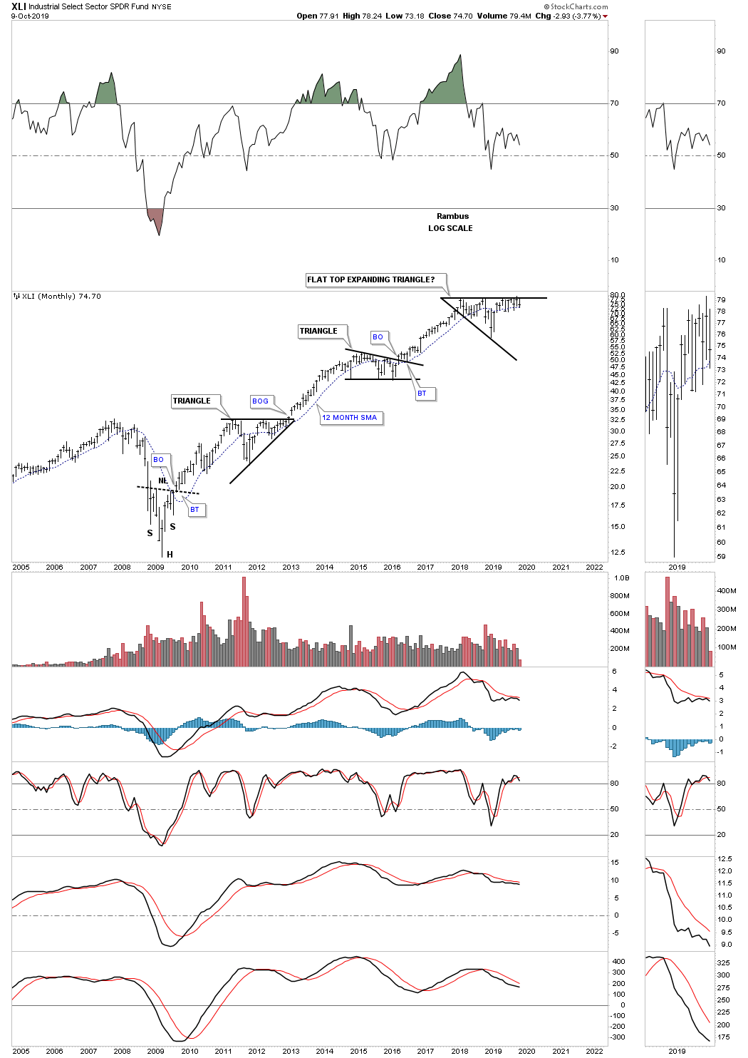
The XLI, Industrial fund, looks a lot like some of the US stock markets which has been building out a flat top expanding triangle since the January 2018 high. This long term monthly chart shows you a good example of how a bull market is supposed to look. First, a bull market starts after you see a reversal pattern of some kind and in this case the 2009 H&S bottom. The breakout above the neckline produced a nearly 2 year impulse move higher which was consolidated by the black triangle. After that black triangle finished its job of consolidating the first leg up the next impulse move began which lasted close to another 2 years with the middle black triangle consolidating that move. The third impulse move of the 2009 bull market is being consolidated by our current flat top expanding triangle. At some point we are going to see another reversal pattern form, maybe inversely to the 2009 H&S bottom, which will end the bull market. For now the trend remains our friend.
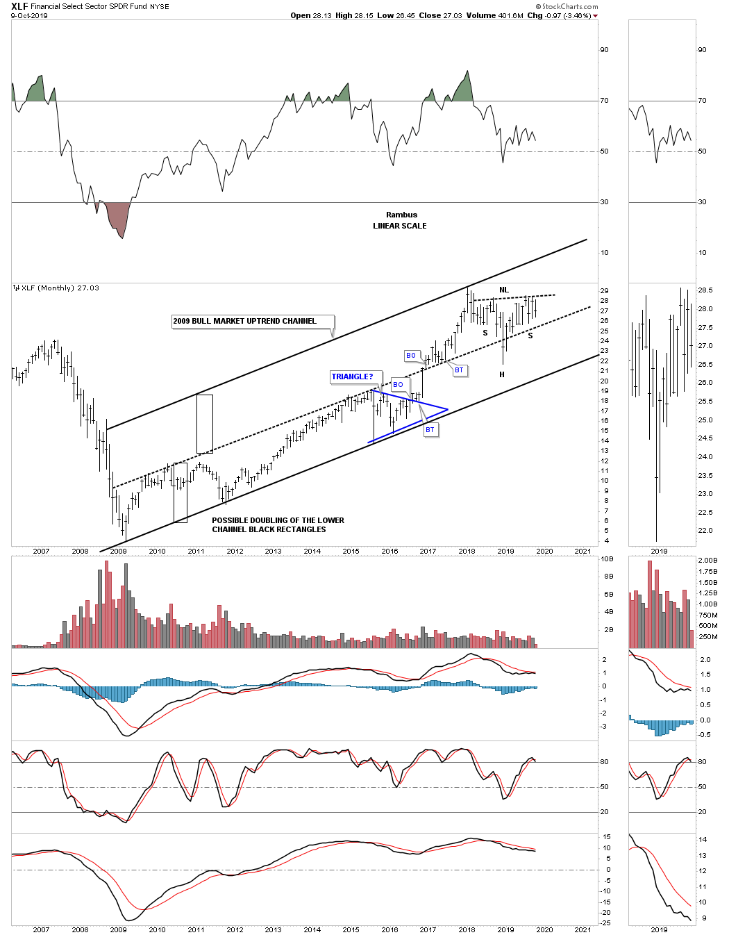
If the US stock markets are going to breakout to new all time highs at some point in the future then the XLF, Financial sector, is also going to have to breakout to new all time as well, out of its January 2018 H&S consolidation pattern.
Note the nice tight lower trend channel that formed between the bear market low in 2009 to the breakout above the center dashed midline in December of 2016. Many times a breakout above an important trend channel can lead to a doubling of the original trend channel as shown by the black rectangles which are exactly the same height. You can see how the center dashed midline held support once it was broken to the upside except for the one month shakeout which occurred last December which could be the head portion of the 2018 H&S consolidation pattern.
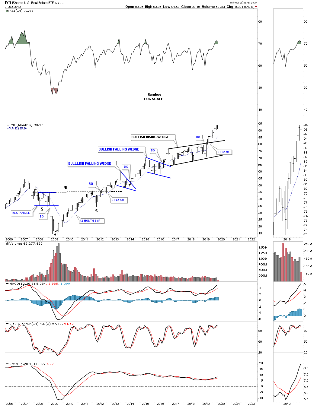
This last sector we’ll look at tonight is the IYR, Real Estate etf, which is probably the strongest area right now as it is very close to making a new all time high since breaking out of its 2016 six point bullish rising wedge.
If we stand back and look at the bull market that began in 2009 the uptrend is still firmly intact with many sectors trading close to their all time highs while some are lagging which is normal. When the bull market does come to an end all the different sectors will get their shot at all time highs with some topping out before others. In the 2000 topping phase some of the strongest sectors began topping out before some of the weaker areas which masked their decline. When the topping process is completed is when you get your bear market in no uncertain terms and everything goes down. In Part 4 of this Quarterly Report, we’ll look at the precious metals complex. All the best…Rambus
Quarterly Report Part 4… Precious Metals Complex
In part 4 of this Quarterly Report we’ll take a look at the precious metals complex which enjoyed being one of the strongest areas in all of the different markets we follow during the 3rd quarter. While most of the different indices we’ve been looking at so far are still chopping around inside of their January 2018 trading ranges the PM complex actually enjoyed a nice impulse move higher.
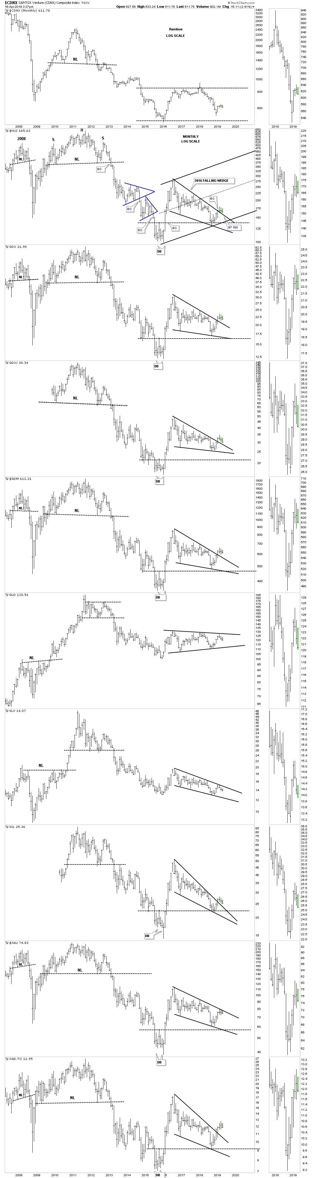
This first chart for tonight is the long term monthly chart for the PM complex we’ve been following for many years that is taken from the first Quarterly Report for 2019. As you can see many had already broken out of their 2016 falling wedge and were in backtest mode to the top rail. Note that GLD, SLV, and the XAU were still trading inside of their 2016 trading ranges back in April of this year, while everything else experienced their breakout.
I used the HUI as a proxy for the rest of the PM stock indexes as I ran out of annotations to label everything else properly. Take a second to review this combo chart from the 1st quarter of 2019 and then I’ll post the current PM monthly combo chart so you can see how well most of the complex has done since April.
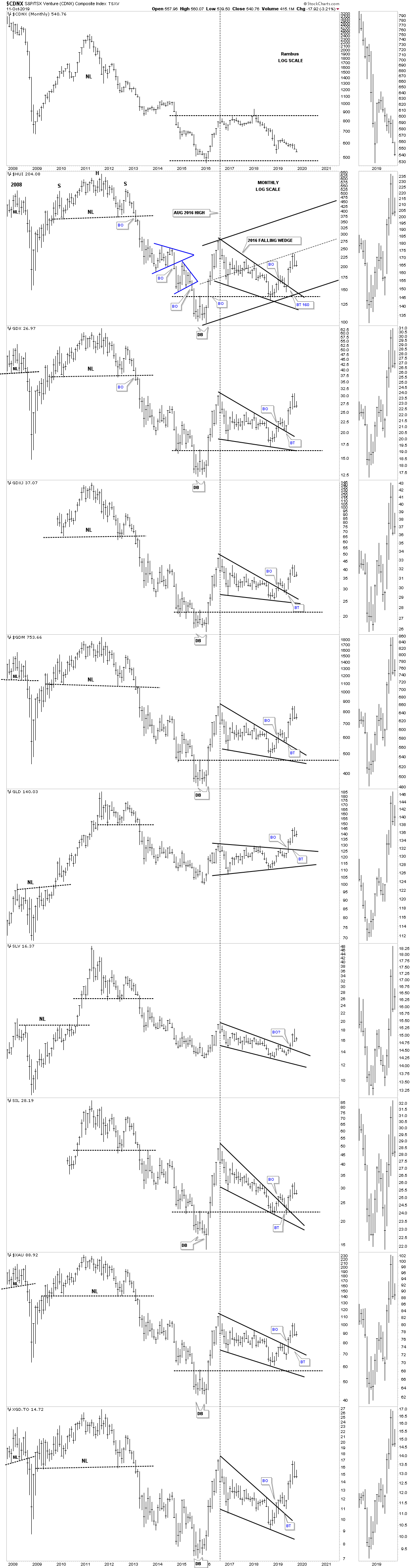
Below is the current monthly PM combo chart which shows the backtesting process finished up shortly after the first Quarterly Report was published with most experiencing a nice four month vertical move higher. The HUI which, whichI’m using for a proxy for the rest of the PM stock indexes, made it all the way up to its center dashed mid line of its potential new uptrend channel where it found resistance and is backing off. Also GLD, SLV and the XAU all joined the party by finally breaking out of their 2016 trading ranges. So far the Chartology has been doing its job of showing us the breaking out and backtesting process followed by a strong rally where initial resistance may have been reached at the center dashed mid line on the HUI.
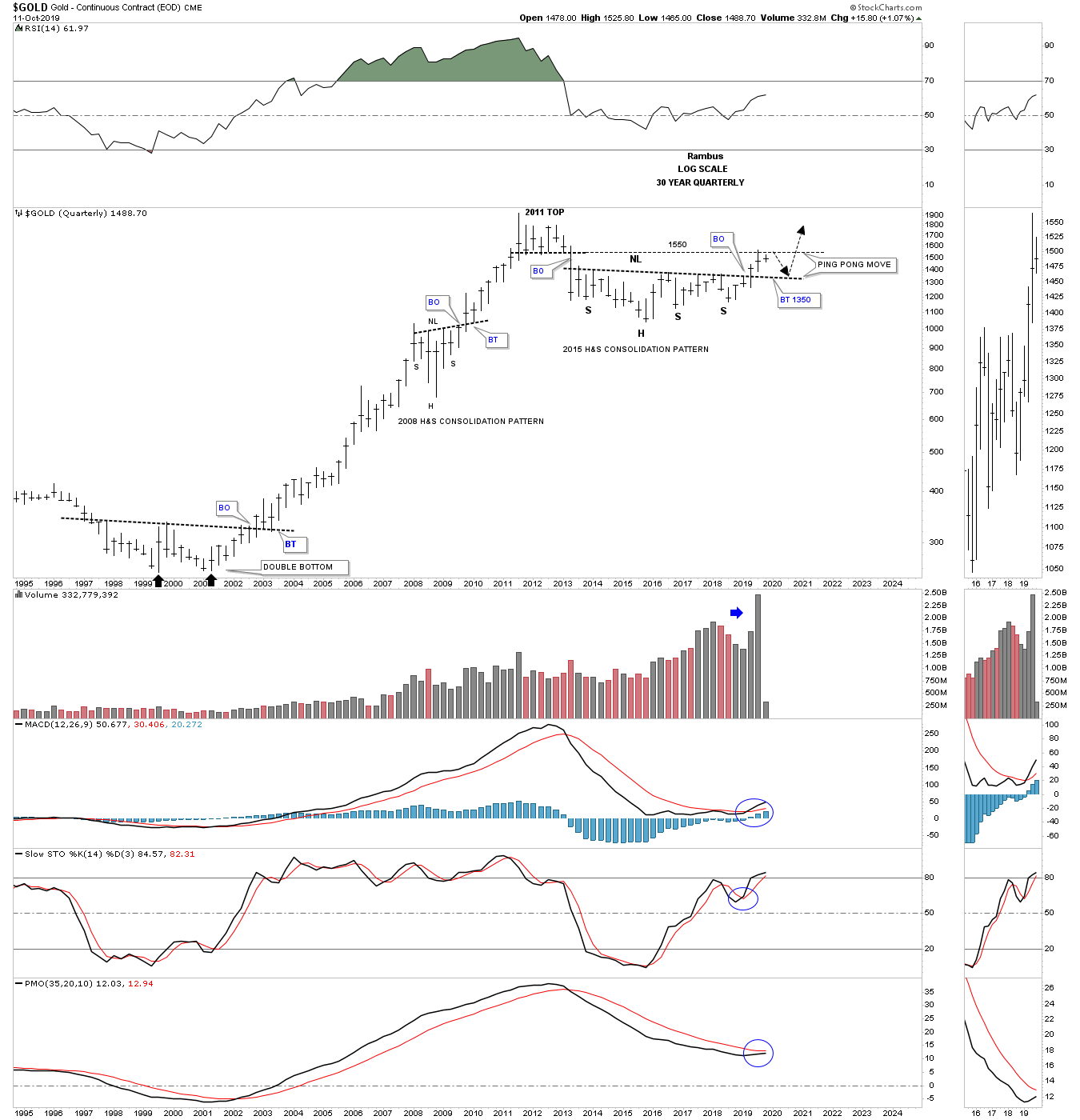
In the Late Friday Night Chart I showed you this Quarterly Chart for gold going back to the beginning of the bull market in 2000. I made the comparison to our current multi year H&S consolidation pattern to the 2000 multi year double bottom reversal pattern. We specifically looked at the 3 quarterly bars that show the breaking out and backtesting phase to the double bottom trendline in 2002. We then compared that 3 quarter bar breakout phase to our current breaking out and backtesting phase that is currently underway. The reason I showed you that quarterly chart was so you could see the backtest to the neckline around the 1350 area which would be perfectly normal and should be expected to finish up all the work to launch the next impulse move higher.
Before we move on I want to make a very important point right here on how important that 6 year H&S neckline is that comes into play around the 1350 area. That is my line in the sand, above the neckline is bullish and below is bearish. A failure of that neckline to hold support on a possible backtest would be totally unacceptable for any reason. It seems like a given that the current leg up in golds bull market is 100% guaranteed but there are no absolutes when it comes to the markets, odds yes but no absolutes.
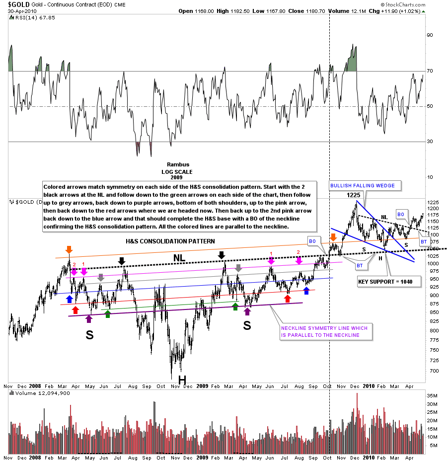
I would like to show you a similar situation to the 6 year H&S consolidation pattern on the quarterly chart above but this H&S bottom is much smaller and is still relevant. It’s been many years since I last posted this 2 year daily chart for gold which shows the H&S consolation pattern that formed at the 2008 crash low. This nearly 2 year H&S consolidation pattern is probably one of the most symmetrical H&S patterns I’ve ever had the pleasure to build. I won’t go into a lot of details since I’ve already described the symmetry on both sides of the head, just above the neckline, with the colored symmetry necklines and colored arrows.
The point I want to make with this chart is how the breaking out and backtesting took place which may be similar to what we are currently seeing right now with the 6 year H&S consolation pattern. Note the nice clean breakout above the heavy black dashed neckline and the backtest that quickly followed. After the backtest was completed gold enjoyed a strong rally that looked like all the work was done and we would never see that thick black neckline again. After rallying up to 1225, close to a 200 point move, gold ran out of gas and began to decline. At first nothing seemed out of the ordinary as the decline picked up a little momentum to the downside. Armed with Chartology the first place to look for important support was down to the neckline which came into play at the 1040 area that was hit in February 2010 four months after the initial breakout.
The backtest to the neckline produced the blue bullish falling wedge with a classic H&S bottom where the left shoulder and head formed inside of the falling wedge with the right shoulder low forming around the top rail. Finally after 4 months of work the next impulse move began which would eventually lead gold to its 2011 bull market high at 1920.
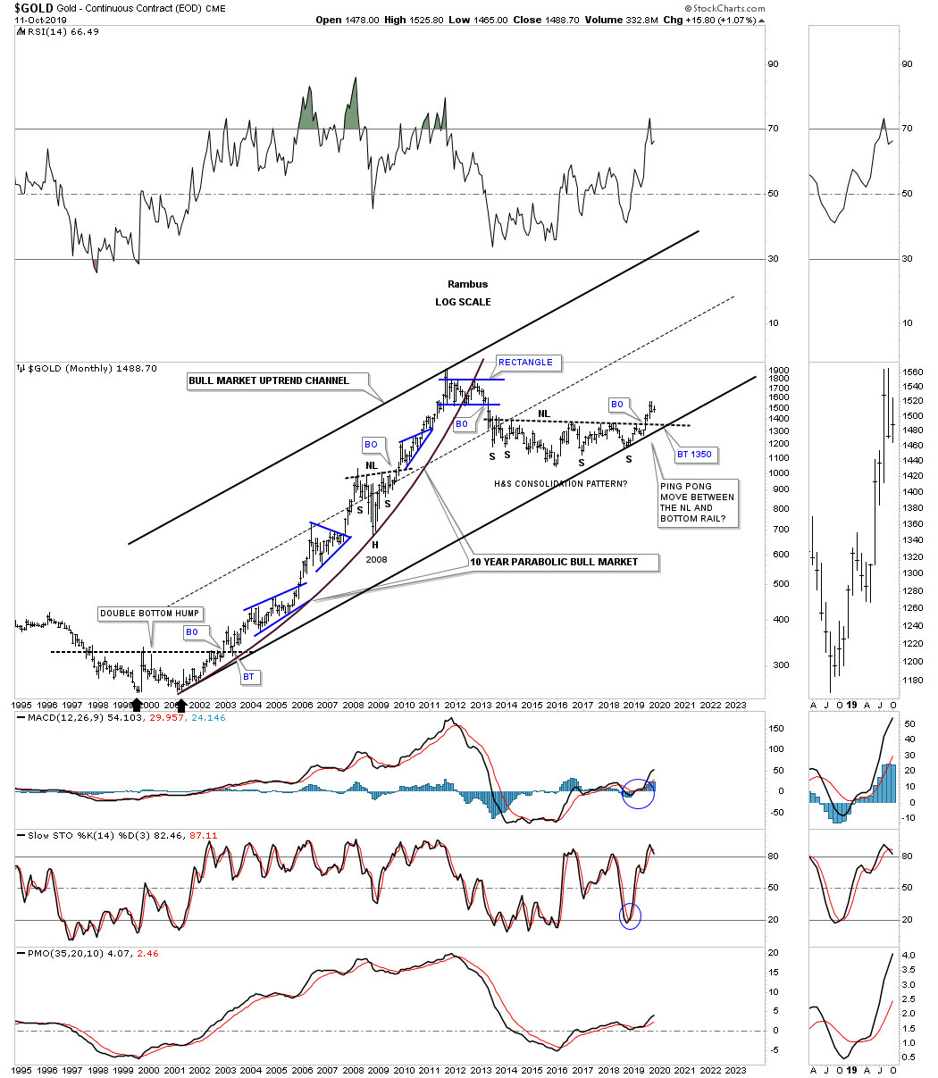
To see how the 2008 H&S consolidation pattern and the 2015 H&S consolidation look in the big picture, below is a long term monthly chart which puts these two patterns in perspective. You can see the beautiful symmetry of the 2008 H&S consolidation pattern with a nice clean breakout and backtest and then the impulse move to the all time high made in 2011. There is no law that says we have to have a backtest to the 2015 H&S neckline at the 1350, area but from a Chartology perspective it just seems like the right thing to do.
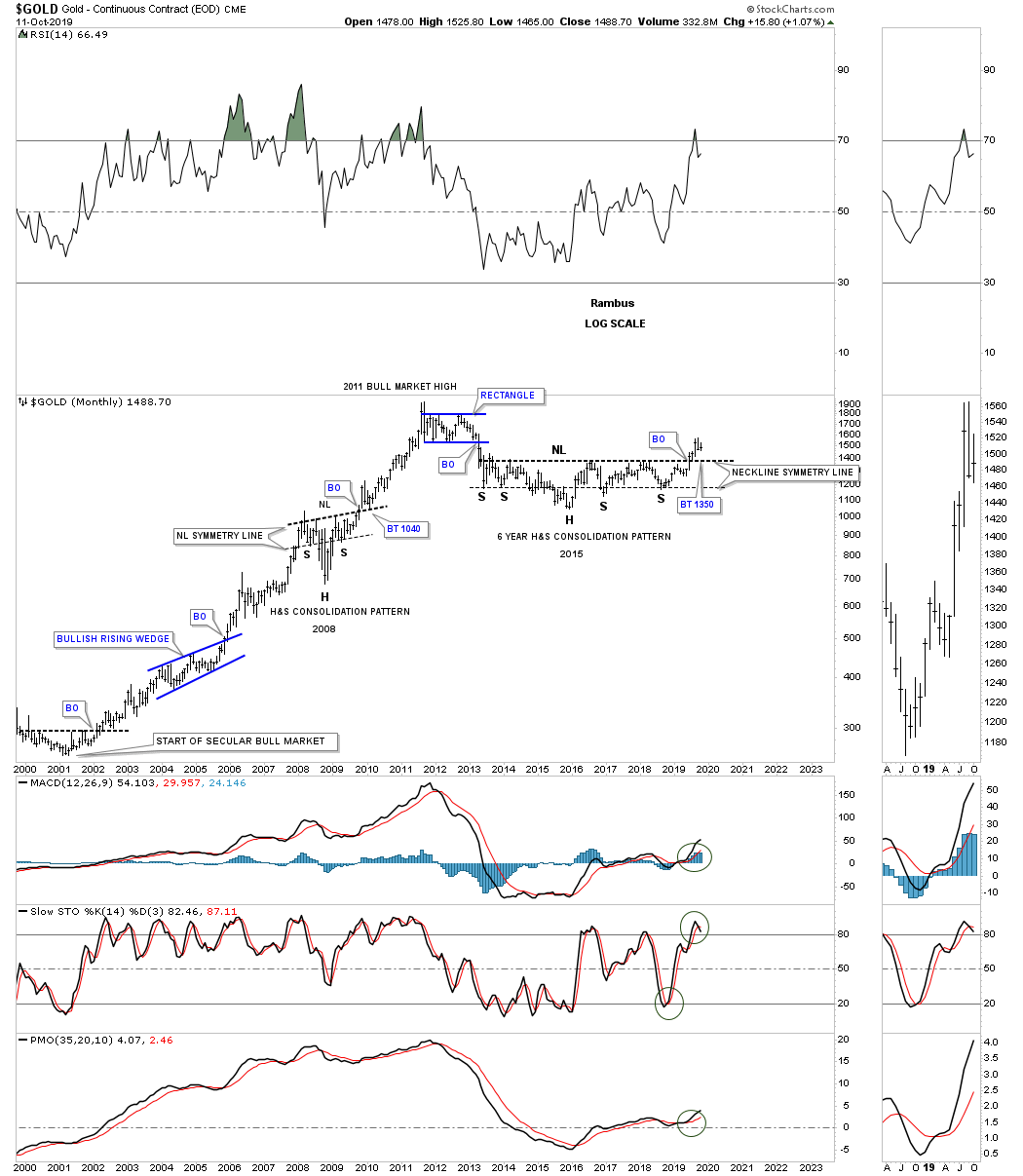
Gold’s 10 year bull market was so strong that it produced a parabolic arc that was finally broken during the formation of the 6 point blue rectangle at the all time high area. Some of you may remember when I suggested we could see a ping pong move between the 2015 H&S neckline and the bottom rail of the major uptrend channel before the neckline finally gave way. There were many touches of the neckline that started to form all the way back to the middle of 2013 from below that should now reverse its role to support. Investors who bought gold below the neckline are still holding on to a profit and will hold tight unless the neckline gives way. That’s the simple psychology of how a support and resistance zone works.
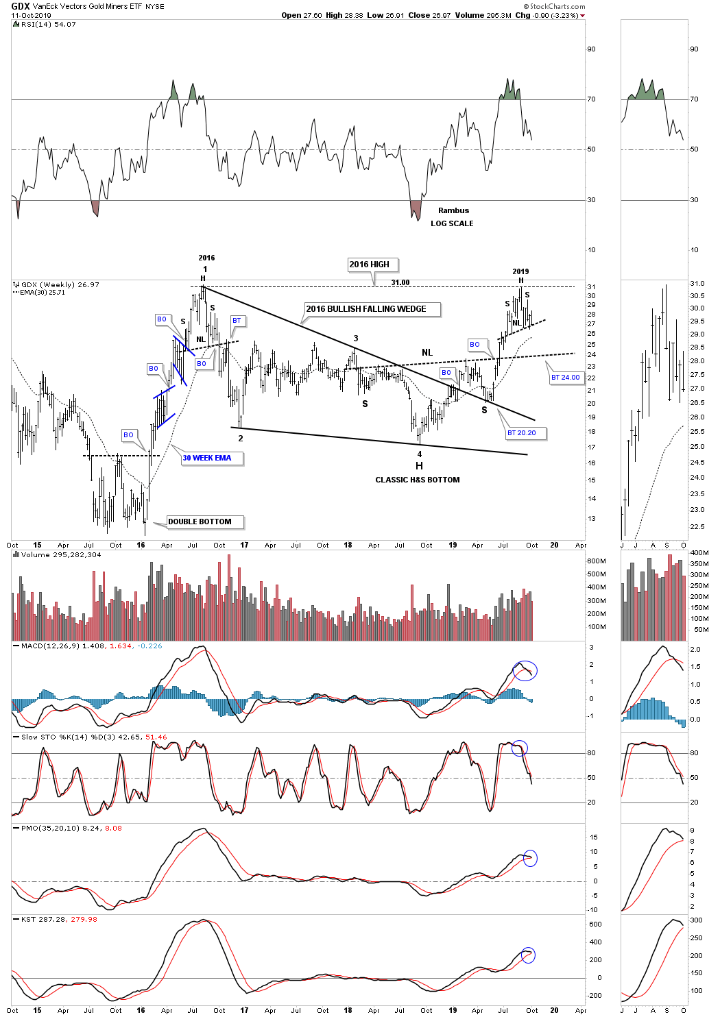
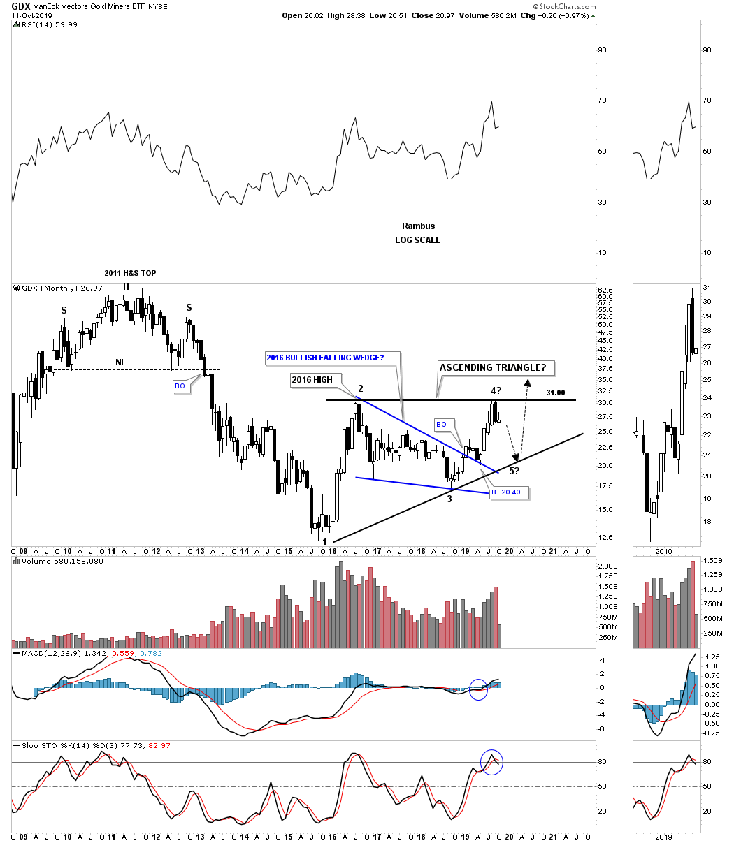
Next lets look at the GDX as a proxy for the rest of the PM stock indexes starting with this 2 year daily chart. In early 2018 the bear market for the GDX was still ongoing with no end in sight. The last consolidation pattern that formed during the bear market was the blue bearish rising wedge which broke to the downside in July of 2018. The bear market low came on September 11th. From that bear market low the GDX began a slow and choppy rise which was hard to make any sense of the price action and what type of pattern would eventually form, either a consolidation pattern to the downside or a reversal pattern to the upside. Slowly a diamond began to show itself which ended up with 7 reversal points which made the diamond a reversal pattern and as we can see in hindsight was the head for the 18 month H&S bottom.
After breaking out from the diamond reversal pattern the GDX started its first impulse move higher in its new bull market. That initial move ran out of gas in late February of this year and then began to consolidate that move by forming its first consolidation pattern which ended up being a bullish expanding falling wedge right shoulder. I’ve mentioned many times in the past that these patterns are extremely difficult to spot in real time because the last low is much lower than normal. The 200 day sma came in and offered some support at the fourth reversal point which ended up being the right shoulder low.
From that right shoulder low the rally was much stronger than the previous one which led up to the neckline. As you can see the neckline was broken by a large breakout gap without any backtest. The GDX rallied strongly until just falling shy by a point and a half of the H&S price objective of 32.50. That brings us up to our current situation.
After basically reaching the H&S price objective it was time to start consolidating that first impulse move. We now have two options in front of us. The first options is some type of consolation pattern will buildout and when completed the next impulse move to the upside will begin. The 2nd option is the possible H&S top which is a reversal pattern and is reversing the one year rally off the September 2018 low. If the H&S top plays out important support would show up at the 18 month H&S neckline where the 200 day sma intersect around the 24.00 area. So from a Chartology perspective, above the 18 month H&S neckline is bullish and below is bearish.

This next chart for the GDX is a 5 year weekly chart which I consider to be the most important chart for the GDX itself and the PM stocks in general. On the left hand side of the chart you can see the vertical rally that occurred in 2016 that topped out about 8 months later in August. The price action formed a H&S top that reversed that massive vertical move which led to a 2 year decline that didn’t find a bottom until September of 2018. That low in September of 2018 also marked the 4th reversal point in the 2016 bullish falling wedge and was the launching point for the one year rally.
My concern is where our recent rally stalled out that was the 2016 high which would be the first place to look for upside resistance which we have gotten. Normally I like to see a small consolidation pattern form just below an important trendline which generally gives the stock the energy it needs to finally break free of overhead resistance. As you can see I have a possible H&S top forming at the 2019 high that is a reversal pattern to the downside if it plays out unlike a consolidation pattern that would have upside consequences.
Now you can see how the 18 month H&S bottom, that we just looked at on the daily chart above fits into the bigger picture. Again, our first line of support is going to be the neckline which comes into play around the 24 area. I also want to point out the beautiful Chartology on this chart starting with the 2015 double bottom reversal pattern which launched the infamous 2016 vertical rally. Then there was the 2016 H&S top reversal pattern which reversed that impulse move. From that 2016 H&S top the GDX began to chop out the several year 2016 bullish falling wedge.
At the fourth reversal point in the 2016 falling wedge formed a classic H&S bottom where the left shoulder and head formed inside the falling wedge with the right shoulder low forming on the backtest to the top rail. After the backtest right shoulder low was complete came our most recent rally which stalled out at the 2016 high and currently leaves us with another possible H&S top reversal pattern in place. Keep in mind the possible H&S top won’t be complete until the neckline gives way so there is still hope but hope is not a way to trade.
Below is a 10 year monthly chart for the GDX which shows the massive 2011 H&S top which led to the bear market. You can also see the 2016 bullish falling wedge and how it fits into the big picture with a nice clean breakout and backtest to the top rail. After the backtest was completed we had a string of 4 white candlesticks all in a row that usually suggests a strong impulse move is taking place. Then during a strong impulse move, when you see a black candlestick form, that can suggest a small consolidation pattern is forming which we now have in place.
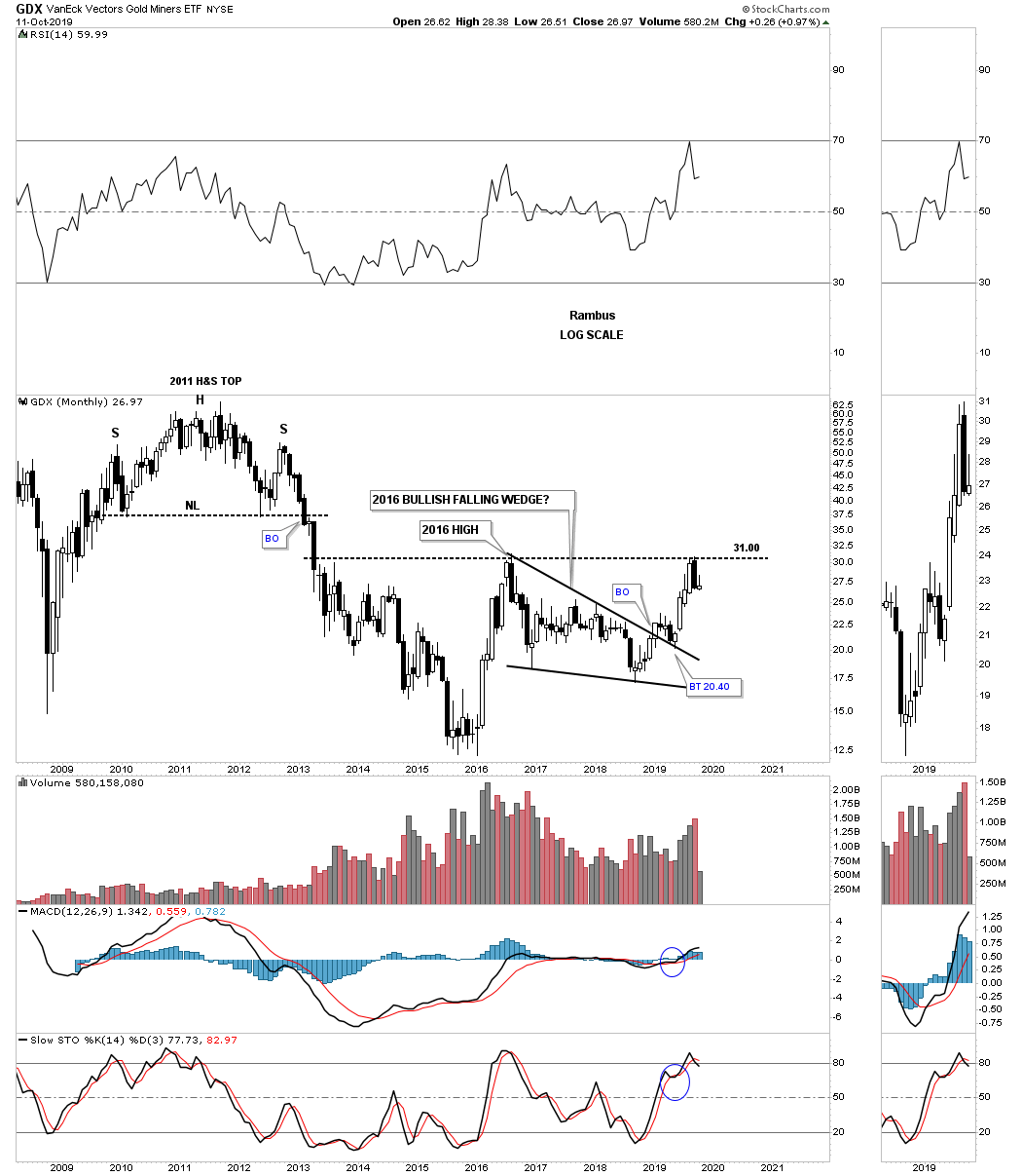
As you know I’ve been extremely bullish since we hit the 2016 high last month where I went to 100% cash in the gold stocks portfolio. I anticipated some type of reaction off that 2016 high but had no idea what type of reaction it would be only that the odds favored something.
This last chart for tonight is a monthly chart that is showing a possible pattern that is just coming to light since the September high where the possible H&S top is forming on the daily chart. I don’t have to tell you that the markets like to confound as many investors as possible before an important move takes place. The bullish enthusiasm in the PM complex has been pretty strong which for me warrants caution at least in the short term and possibly the intermediate term. The last thing on the PM investors mind right now is that there could be a bigger correction than what most believe is even possible. I would even venture to say that most are still holding on to their original positions oblivious to any possible downside price action.
I have tried to temper your enthusiasm when I saw it start getting out of hand as the GDX was approaching the 2016 high at 31.00. Investors emotions are the number 1 killer when it comes to the markets. For close to four months some of our PM stocks were going up 30% to 40% a month without any serious pause to refresh which told us we were in a strong impulse move. It is still possible that our current small September trading range is going to be a consolidation pattern instead of the H&S top reversal pattern which I would welcome with both hands. On the other hand there is always the possibility that if the small H&S top plays out will you have the courage, fortitude and discipline to ride out the possible bigger than expected correction without selling your shares at the bottom?
I’ve always tried to present to you an unbiased opinion based on what the charts are suggesting to me is the right way to trade the markets which isn’t always right. I’ve learned a long time ago that preservation of capital is the most important and hardest lesson the markets have ever taught me. Without trading capital you are dead in the water with no chance of success. We should know fairly soon which way the PM complex wants to go in the short to the intermediate term. All the best…Rambus
Quarterly Report Part 5… Odds and Ends
Tonight I would like to finish up this 3rd quarter “Quarterly Report” by looking at some charts on currencies, interest rates and a few commodities. Of all the different areas in the markets, interest rates have had one of the largest moves of all while most currencies and commodities in general have gone nowhere fast.
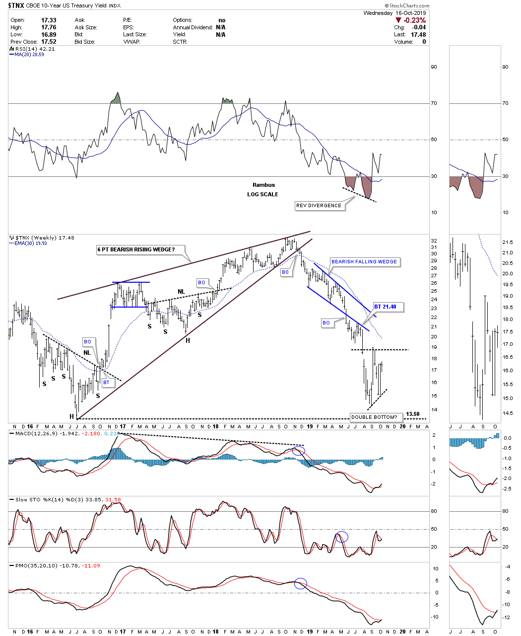
Lets start with a weekly chart for the $TNX which has produced some nice Chartology over the last 5 years. After a 2 year rally that began in the middle of 2016 and ran to the middle of 2018 the $TNX built out a 5 point bearish expanding rising wedge reversal pattern to end that bull run. Shortly after breaking down below the bottom rail of the expanding rising wedge the price action showed us in no uncertain terms that interest rates were going much lower than most investors thought. Over the next 5 month the $TNX built out the bearish falling wedge which was the biggest clue that interest rates were headed lower and in a hurry.
Since the first of September of this year the price action is finding some initial support at the 2016 low and possibly forming an unbalanced double bottom. The reason I say a double bottom is possible is because we are seeing a reverse divergence on the RSI to the recent price action. Also the RSI may be forming a H&S bottom. There is still a lot of work to do before we can call a low in interest rates but the initial signs are beginning to appear.
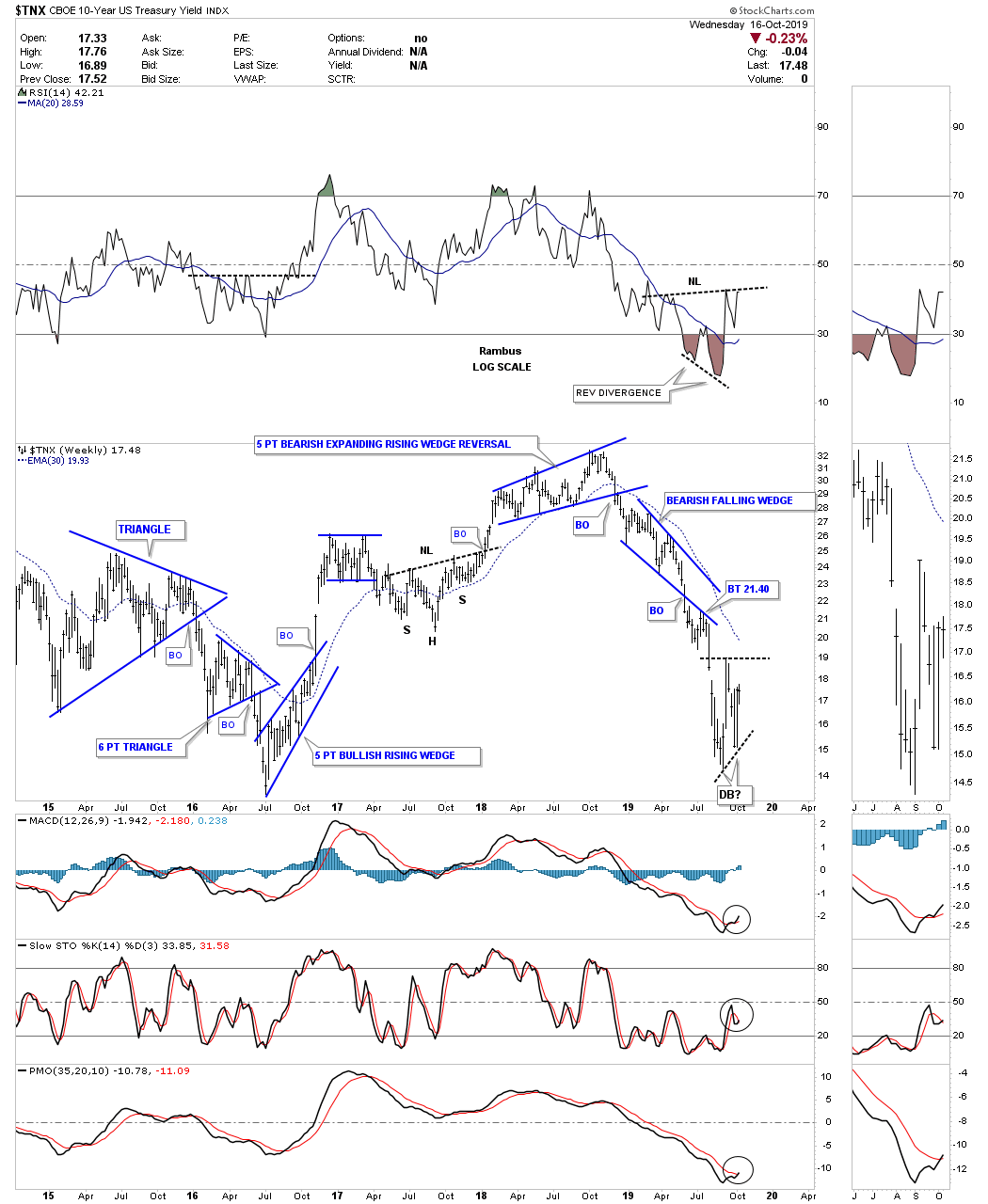
Here is a slightly different view of the weekly chart above which shows the 2 year rally from the middle of 2016 to the middle of 2018 forming a 6 point bearish rising wedge. The minimum price objective for a rising wedge formation is down to where the rising wedge began to form which is at the head portion of the 2016 H&S bottom. This is another reason why we may have seen the low for interest rates at least in the intermediate term.
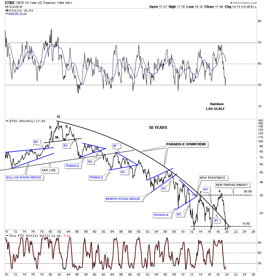
This 3rd chart for the $TNX shows us one more reason why the low for interest rates may have finally bottomed. Below is a 50 year monthly line chart which shows a massive parabolic arc to the downside. The $TNX initially bottomed in 2012 and had a decent rally up to reversal point #2 which I labeled at the time as a new trading range. Since then the price action has been trapped inside of that trading range and has just recently found support once again at the bottom of the almost 7 year trading range completing the 4th reversal point. There are only 2 options for the $TNX right now with the first option being the 7 year trading range is going to be a reversal pattern to the upside or if the bottom rail gives way we’ll see a consolidation pattern that will break to the downside and signal much lower interest rates ahead. The bottom line is that this is a critical inflection point right here and now.
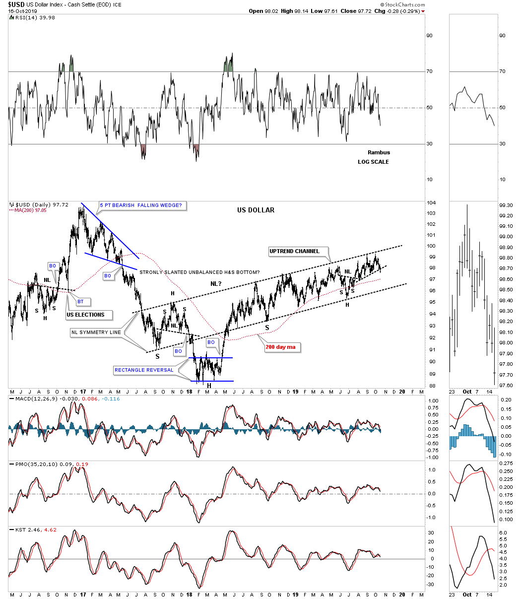
Next lets take a look at a few US dollar charts which have been going nowhere fast but with an upward bias. Since August of 2018 the US dollar has been slowly grinding its way higher forming a rising wedge formation with no end in sight as to which direction the price action may breakout. In the last Quarterly Report the US dollar was attempting to breakout from the small H&S bottom which it ended up doing. Today it looks like the price action is breaking down below the black dashed S&R line which will most likely send the US dollar back to the bottom of the rising wedge formation.
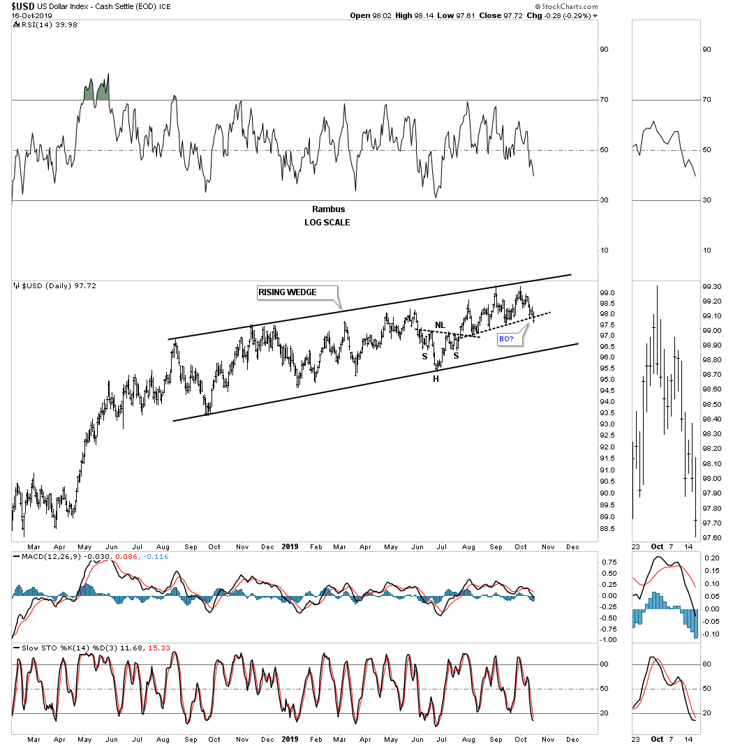
About a year ago in September I originally thought that the US dollar was going to build out a one year H&S bottom as there was some pretty nice symmetry as shown by the neckline symmetry line where the low for the left and right shoulder formed. After reaching the top rail of the uptrend channel the US dollar couldn’t push through and began another year of chopping higher. How much longer can this go on is anyones guess. When the US dollar is ready to show its hand we’ll be waiting.
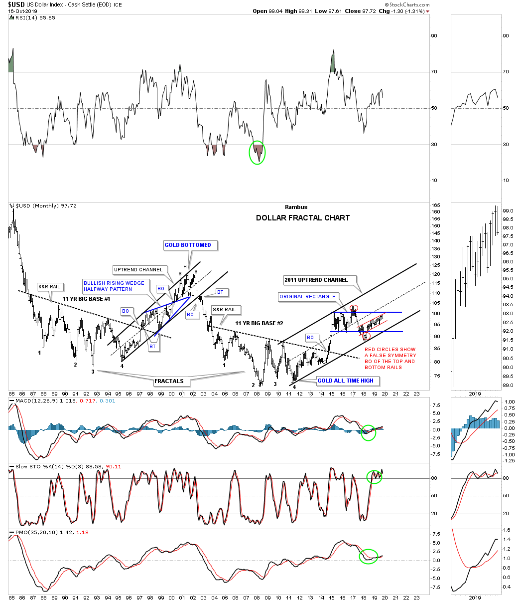
Below is the old fractal chart for the US dollar we’ve been following for many years which has the 11 year fractal bases #1 and #2. Since 2011 the US dollar has been trading in a parallel uptrend channel reaching the first high in March of 2015 where the price action began to chop sideways, blue rectangle. Initially the US dollar formed a perfect rectangle until the price action broke out above the top rail that looked like a breakout was taking place, red circle. After failing to impulse higher the price action traded back inside of the blue rectangle which officially negated the breakout.
After trading back inside of the blue rectangle the US dollar traded below the bottom rail and looked like a breakout to the downside which again was negated when the price action traded back inside the rectangle. You may recall the symmetry failures we looked at on some of the US stock markets a month or so ago when their original triangle morphed into a slightly bigger trading range. This is similar but here we have an equal breakout above and below the rectangle which leaves the US dollar in neutral territory. The small red uptrend channel is the same one we looked at on the daily charts above. At this point I would have to label the US dollar as still in an uptrend which began in 2011.
Lets finish up by looking as some commodifies that is probably still one of the weakest area in the markets. The only positive thing about most commodities is that they are trading at the low end of their trading range. At this point I’m content to just watch the price action for the time being and wait for something more concrete before we can say the bear market is over.
Below is a 20 year monthly chart for the $CRB index which shows a rising wedge building out since the 2016 low. There was a breakout to the downside with a backtest to the underside of the bottom rail. What is lacking so far is for the impulse move to gain any momentum to the downside.
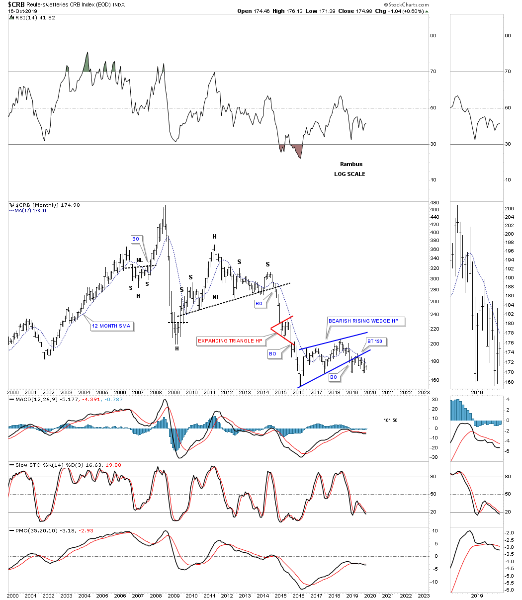
This quarterly chart for the CRB index shows how the blue rising wedge fits into the very big 75 year picture. Until the price action takes out the April 2016 low I’m going to remain neutral.

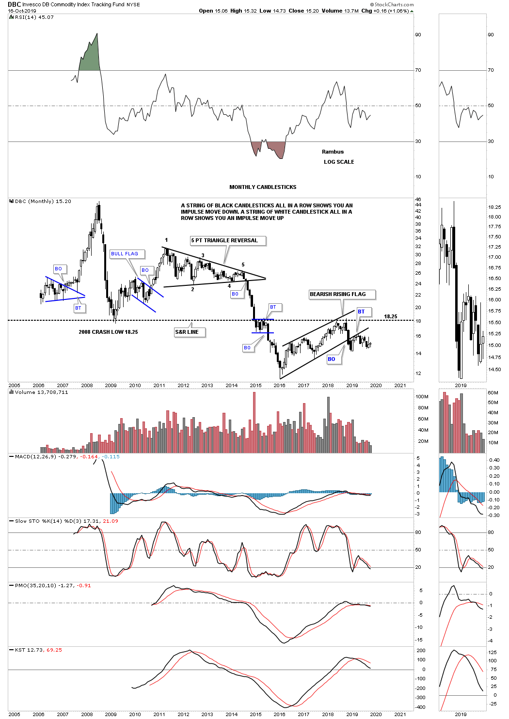
The DBC is another commodities index which trades with a lot of volume. After breaking down below the 2008 crash low the price action rallied back up to the 2008 crash low at 18.25 where it reversed its role to now resistance. Nothing to get excited about here yet.
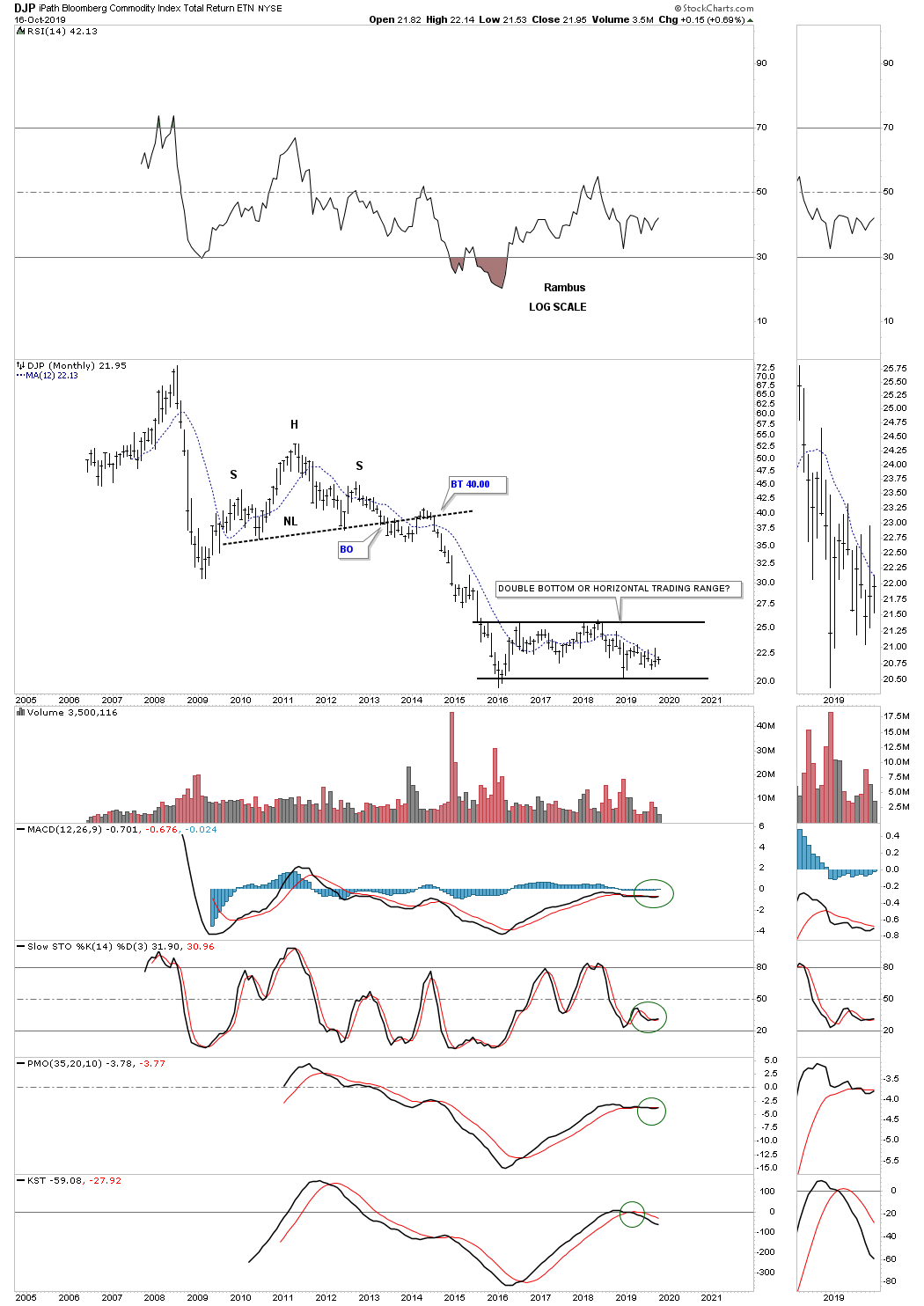
The DJP is another commodity index which has been chopping sideways since its 2016 low with no end in sight on what direction the breakout will occur. We’ll be ready when it finally shows its hand.
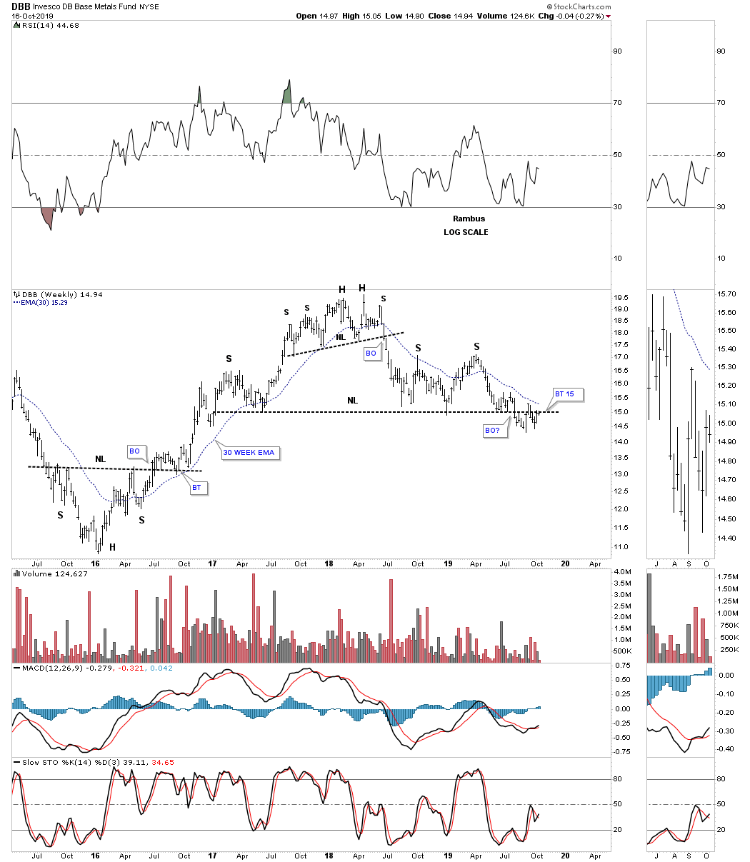
The DBB is a base metals fund which is showing a nice H&S top with a breakout and backtest in place but no impulse move to the downside yet. So we wait.
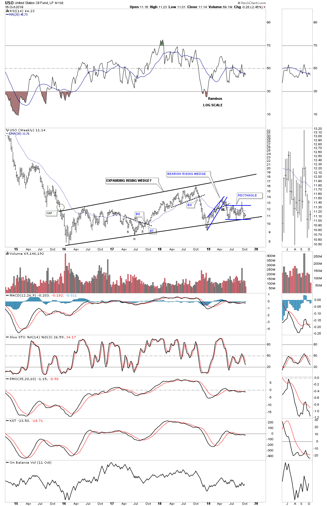
This last chart we’ll look at is a 5 year weekly chart for the USO, US oil fund, which has been chopping out an expanding rising wedge since its 2016 low. Since April of this year the price action has been chopping out the blue rectangle on the bottom rail of the expanding rising wedge.
If oil could start to rally in a meaningful way that would be good for many of the commodity indexes which are heavily skewed with oil. A stronger oil price but not too strong, would also be good for the US stock markets as it would show a strong demand for oil from a growing economy.
Since the last Quarterly Report, the US stock markets are still trading inside of their 2018 trading range consolidating the last impulse move up. The PM complex had the best move since the last Quarterly Report rallying strongly in its impulse move that may have run out of gas in the short to intermediate term. The US dollar and commodities have gone virtually nowhere still looking for something to excite them one way or another. With the 4th quarter now upon us what will some of these charts look like when it’s time to do the Quarterly Report for the 4th quarter? All the best…Rambus
Related Reading:
- Rambus: Blockbuster Chartology – July, 2019
- Rambus: Blockbuster Chartology – April, 2019
- Rambus: Blockbuster Chartology – January, 2019
- Rambus: Blockbuster Chartology – October, 2018
- Rambus: Blockbuster Chartology – July, 2018
- Rambus: Blockbuster Chartology – April, 2018
- 2017 Annual Wrap Up – Does Your Pension Fund Have A Deep State Drain? – January, 2018
- 1st Quarter Wrap Up 2018 Web Presentation
- Blockbuster Chartology with Rambus – October, 2017
- Blockbuster Chartology with Rambus – July, 2017
- Blockbuster Chartology with Rambus – May, 2017
- Blockbuster Chartology with Rambus – January, 2017
- Blockbuster Chartology with Rambus – October 20, 2016
- Blockbuster Chartology with Rambus – July 21, 2016
- Blockbuster Chartology with Rambus – April 21, 2016
- Rambus: Are We in a Deflationary Spiral? – January 28, 2016
- The Dollar, Gold & the S&P 500 with Rambus – October 15, 2015